
That default purple button has to go.
Learning how to change button color in Android Studio takes your app from generic template to polished product. Button styling directly impacts how users perceive your brand and interact with your interface.
The catch? Material Design themes override standard background attributes. Many developers waste hours wondering why their color changes aren’t working.
This guide covers six methods: XML backgroundTint, color resources, programmatic changes in Kotlin and Java, drawable selectors, MaterialButton fixes, and dark mode support.
Each step includes exact file paths, working code snippets, and the specific attribute values you need. No guesswork required.
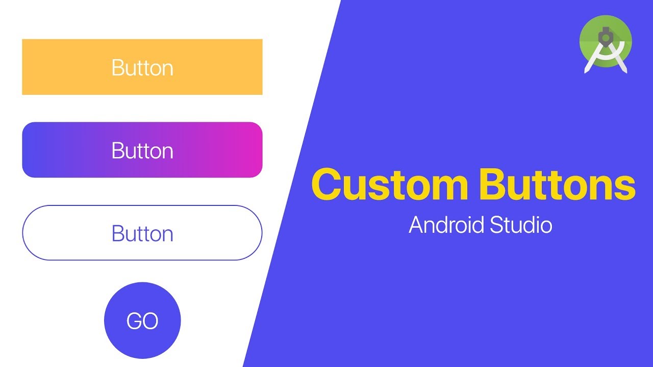
How to Change Button Color in Android Studio
Changing button color in Android Studio is the process of modifying a Button widget’s background appearance using XML attributes or programmatic methods.
Users need this when customizing app themes, matching brand colors, or creating visual feedback for button states.
This guide covers 6 methods requiring 5-15 minutes total. Skill level ranges from beginner (XML changes) to intermediate (drawable selectors and programmatic approaches).
If you’re new to the IDE, check out what Android Studio is before diving in.
Prerequisites
Before you start, make sure you have everything ready.
- Android Studio version 2022.1.1 (Electric Eel) or later
- An existing Android project with at least one Button widget in your layout
- Basic understanding of XML layout files and the res folder structure
- Access to res/values/colors.xml and res/drawable folder
- Minimum SDK: API 21+ for android:backgroundTint, API 7+ with AppCompat library
Time estimate: 5-10 minutes per method.
Working with Kotlin or Java? Both languages work for programmatic color changes.
Step 1: How Do You Change Button Color Using XML BackgroundTint?
The backgroundTint attribute changes button background color while preserving Material Design ripple effects. Add it directly to your Button widget in the XML layout file to see instant results in the preview panel.
Action
File path: res/layout/activitymain.xml
Add this attribute to your Button element:
“ <Button android:id="@+id/myButton" android:layoutwidth="wrapcontent" android:layoutheight="wrapcontent" android:backgroundTint="#FF5722" android:text="Click Me" /> `
You can use a hex color code directly or reference a color resource with @color/colorName.
The button displays your specified color immediately in the Design Editor preview.
Purpose
The backgroundTint attribute is preferred over the older background attribute for modern Android development.
It keeps the touch feedback and ripple effect animations intact. Using android:background removes these interactive elements entirely.
Step 2: How Do You Define Custom Colors in colors.xml?
Define reusable color resources in your colors.xml file instead of hardcoding hex values throughout your layouts. This approach makes theme changes and brand updates much easier to manage.
Action
File path: res/values/colors.xml
Add your custom color definition:
` <?xml version="1.0" encoding="utf-8"?> <resources> <color name="buttonprimary">#FF5722</color> <color name="buttonpressed">#E64A19</color> <color name="buttondisabled">#BDBDBD</color> </resources> `
Reference it in your Button widget:
` android:backgroundTint="@color/buttonprimary" `
Purpose
Color resources create a single source of truth for your app’s color palette.
Change one value in colors.xml and every button using that reference updates automatically. This follows Material Design principles for consistent theming.
Hardcoded hex values scattered across multiple layout files become a maintenance headache fast.
Step 3: How Do You Change Button Color Programmatically in Kotlin or Java?
Set button background color at runtime when you need dynamic color changes based on user actions, app state, or data from an API. This method gives you full control over when and how colors change.
Action
Get the button reference and apply the color in your Activity or Fragment:
Kotlin:
` val button = findViewById<Button>(R.id.myButton) button.setBackgroundColor(Color.parseColor("#4CAF50")) `
Java:
` Button button = findViewById(R.id.myButton); button.setBackgroundColor(Color.parseColor("#4CAF50")); `
For better compatibility across API levels, use ViewCompat:
` ViewCompat.setBackgroundTintList( button, ColorStateList.valueOf(Color.parseColor("#4CAF50")) ) `
Purpose
Programmatic changes work when button colors depend on runtime conditions.
Think validation states (green for success, red for error), user preference settings, or data-driven UI updates.
The ViewCompat method maintains Material Design effects and works consistently across different Android versions. Good UI/UX design often requires these dynamic visual responses.
If you want to learn more about working with the IDE itself, see how to use Android Studio effectively.
Step 4: How Do You Create a Drawable Selector for Button States?
A drawable selector defines different colors for pressed, focused, and default button states. Create an XML file in the drawable folder to handle all state variations in one place.
Action
Create file: res/drawable/buttonselector.xml
` <?xml version="1.0" encoding="utf-8"?> <selector xmlns:android="http://schemas.android.com/apk/res/android"> <item android:statepressed="true" android:drawable="@color/buttonpressed"/> <item android:statefocused="true" android:drawable="@color/buttonfocused"/> <item android:stateenabled="false" android:drawable="@color/buttondisabled"/> <item android:drawable="@color/buttonprimary"/> </selector> `
Apply to your Button:
` android:background="@drawable/buttonselector" `
Purpose
Selectors provide visual feedback when users interact with buttons. The order matters: specific states first, default state last.
This approach is standard in mobile application development for polished user experiences.
Step 5: How Do You Handle the MaterialButton BackgroundTint Issue?
Modern Android projects use Theme.MaterialComponents which converts Button widgets to MaterialButton automatically. This causes android:background to be ignored completely.
Action
Check file: res/values/themes.xml
If your theme parent is Theme.MaterialComponents.DayNight.DarkActionBar, use app:backgroundTint instead:
` <Button android:id="@+id/myButton" android:layoutwidth="wrapcontent" android:layoutheight="wrapcontent" app:backgroundTint="@color/buttonprimary" android:text="Click Me" /> `
Add the app namespace to your root layout if missing:
` xmlns:app="http://schemas.android.com/apk/res-auto" `
Purpose
The app: prefix overrides Material theme defaults while keeping ripple animations intact.
Without this fix, buttons stay purple regardless of your background attribute settings. Common frustration point for developers new to the mobile app development process.
Step 6: How Do You Set Button Colors for Dark Mode?
Android switches between light and dark themes automatically based on system settings. Define separate color values for each mode to maintain proper contrast and visibility.
Action
Create folder: res/values-night/
Create file: res/values-night/colors.xml
` <?xml version="1.0" encoding="utf-8"?> <resources> <color name="buttonprimary">#BB86FC</color> <color name="buttonpressed">#9A67EA</color> <color name="buttondisabled">#555555</color> </resources> `
Use the same color names as your regular colors.xml. Android loads the appropriate file based on current theme.
Purpose
Dark mode requires lighter button colors for accessibility. Colors that work on white backgrounds often disappear on dark ones.
Following mobile app best practices means supporting both theme variants.
Verification
Confirm your button color changes work correctly before shipping.
- Preview button in Android Studio Design view; toggle device themes in the toolbar
- Run app on emulator or physical device using Android Studio emulator
- Test button press states by tapping and holding
- Switch device to dark mode in Settings > Display to verify night colors
- Check accessibility contrast using Accessibility Scanner app
The Layout Inspector tool (View > Tool Windows > Layout Inspector) shows actual runtime color values if preview differs from device.
Troubleshooting
Button stays purple despite setting background color
Solution: Use android:backgroundTint or app:backgroundTint instead of android:background.
Material themes override the background attribute on Button widgets. Check your themes.xml parent value.
Ripple effect disappears after changing color
Solution: Switch from android:background to backgroundTint.
The background attribute removes Material Design touch feedback entirely. BackgroundTint preserves it.
Color not updating on API 19 or lower
Solution: Use app:backgroundTint with the AppCompat library.
Add to build.gradle dependencies:
` implementation 'androidx.appcompat:appcompat:1.6.1' `
Learn how to sync Gradle in Android Studio after adding dependencies.
ColorStateList not working programmatically
Solution: Use ViewCompat.setBackgroundTintList() for backward compatibility.
` ViewCompat.setBackgroundTintList( button, ContextCompat.getColorStateList(this, R.color.buttonprimary) ) `
Dark mode colors not loading
Solution: Verify folder name is exactly values-night (not values-dark or night-values).
Color names must match exactly between both colors.xml files.
Alternative Methods Comparison
| Method | Time | Complexity | Best For | | | | | | | XML backgroundTint | 1 min | Low | Static button colors, quick prototyping | | Programmatic (Kotlin/Java) | 2-3 min | Medium | Dynamic colors based on user input or app state | | Drawable Selector | 5-10 min | Medium-High | Custom press/focus states, gradient backgrounds | | Theme Overlay | 5 min | Medium | Consistent styling across multiple buttons |
Choose XML backgroundTint when colors are fixed at design time.
Choose programmatic when colors depend on runtime conditions like validation or API responses.
Choose drawable selector when you need full control over every button state with custom shapes or gradients.
Related Processes
Continue customizing your Android app interface:
- How to change app icons on Android
- How to add images to Android Studio
- How to build APK in Android Studio
- How to rename Android Studio project
- How to connect phone to Android Studio with USB
For broader context on building mobile apps, explore Android SDK tools and mobile app development tools.
FAQ on How To Change Button Color In Android Studio
Why is my button still purple after changing the background color?
Material themes convert Button to MaterialButton, which ignores android:background. Use android:backgroundTint or app:backgroundTint instead. Check your themes.xml file to confirm you’re using Theme.MaterialComponents as the parent.
What is the difference between background and backgroundTint?
The background attribute replaces the entire button drawable, removing ripple effects. BackgroundTint applies a color overlay while preserving Material Design touch feedback and state animations. Use backgroundTint for modern Android apps.
How do I change button color programmatically in Kotlin?
Get the button reference with findViewById, then call setBackgroundColor() with Color.parseColor(“#hexcode”). For better compatibility, use ViewCompat.setBackgroundTintList() with a ColorStateList to maintain ripple effects across API levels.
Can I use different colors for pressed and normal button states?
Yes. Create a selector XML file in res/drawable with item tags for each state. Define statepressed, statefocused, and default colors. Apply the selector using android:background=”@drawable/yourselector” on the Button widget.
How do I support dark mode button colors?
Create a res/values-night folder with its own colors.xml file. Use identical color names with darker or lighter values appropriate for dark backgrounds. Android automatically switches between color files based on system theme settings.
Why does app:backgroundTint work but android:backgroundTint doesn’t?
The app: prefix uses AppCompat attributes that work across all API levels. The android: prefix requires API 21 minimum. Add xmlns:app=”http://schemas.android.com/apk/res-auto” to your root layout element to use app: attributes.
How do I change button text color along with background color?
Add android:textColor=”#hexcode” to your Button XML or use button.setTextColor() programmatically. For state-based text colors, create a color selector in res/color folder and reference it with android:textColor=”@color/buttontextselector”.
What hex color format does Android Studio accept?
Android accepts #RGB, #RRGGBB, and #AARRGGBB formats. The AA represents alpha (transparency). Define colors in res/values/colors.xml for reusability: <color name=”buttoncolor”>#FF5722</color>. Reference with @color/buttoncolor.
How do I preview button color changes without running the app?
Use the Design Editor in Android Studio. Click Split or Design view to see real-time previews. Toggle between light and dark themes using the theme dropdown in the toolbar. The Layout Inspector shows runtime values.
Can I apply the same button color to all buttons in my app?
Yes. Define a custom style in res/values/styles.xml with your backgroundTint value. Apply it globally by adding the style to your app theme, or individually using style=”@style/YourButtonStyle” on each Button widget.
Conclusion
You now have six working methods for how to change button color in Android Studio. Pick the one that fits your project.
XML backgroundTint handles static colors quickly. Programmatic approaches with ViewCompat give you runtime flexibility. Drawable selectors deliver complete control over pressed and focused states.
The MaterialButton theme override trips up most developers. Now you know the fix: use app:backgroundTint with the proper namespace declaration.
Dark mode support through values-night ensures your buttons stay visible and accessible regardless of system theme. Color contrast matters for usability.
Start with your colors.xml file. Define your hex color values there first, then reference them throughout your layouts. Consistent button styling builds a polished user interface that reflects your brand.
Many of his resources are available on various design marketplaces and for free on Codepen.
Over the years, he's worked with a range of clients and contributed to design publications like Design Your Way, Designmodo, WebDesignerDepot, WPDean, Speckyboy, and Slider Revolution among others.
- How to Make a Repository Private in GitHub - July 20, 2026
- How to Set Up Google Play Family Library - July 18, 2026
- How to Run Pytest in PyCharm: A Complete Walkthrough - July 16, 2026


