
Every screen you’ve ever used started as a rough sketch. Before the colors, the animations, the polished UI/UX design, someone had to figure out where things go.
That’s what wireframing is. It’s the process of mapping out the structure and layout of a digital interface before any visual design or code gets written.
And yet, teams skip it all the time. They jump straight into high-fidelity mockups or start building screens without a shared blueprint. The result? Expensive revisions, misaligned stakeholders, and products that don’t match user expectations.
This guide covers what wireframing is, how it fits into the design and development workflow, the types and tools available, and the mistakes that cost teams the most time. Whether you’re a product manager, designer, or developer, this is the foundation everything else sits on.
What Is Wireframing

Wireframing is the process of creating a simplified visual layout of a web page, app screen, or digital interface before any design or development begins.
Think of it as a stripped-down blueprint. No colors, no images, no fancy typography. Just boxes, lines, and placeholder text arranged to show where everything goes on a page.
The wireframe captures structure, content placement, and the basic hierarchy of information. It answers one question: what goes where?
Teams across software development use wireframes to align early on what a product will look like before anyone writes a single line of code. According to MarketSplash, 60% of web designers use wireframes as a regular part of their workflow.
A wireframe is not a finished design. It’s a conversation starter. It gives product managers, designers, and developers a shared reference point so nobody builds the wrong thing.
How Wireframes Differ from Mockups and Prototypes
These three terms get tossed around like they mean the same thing. They don’t.
| Deliverable | Fidelity | Purpose | Interactive? |
|---|---|---|---|
| Wireframe | Low | Structure and layout | No |
| Mockup | Medium–High | Visual look and feel | No |
| Prototype | High | User interaction testing | Yes |
Wireframes use grayscale boxes and placeholder content. They focus on page structure and content hierarchy, nothing else.
Mockups layer in real colors, fonts, icons, and branding on top of the wireframe skeleton. Static but visually polished.
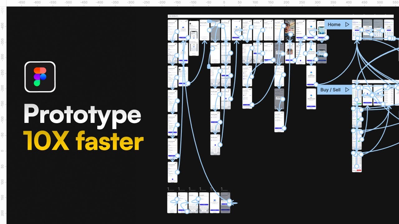
Prototypes take mockups further by adding clickable elements and simulated user flows. They let you test how someone actually moves through the product.
Figma’s own documentation puts it well: wireframes support exploration, mockups validate visual design, and prototypes confirm functionality.
Where Wireframing Fits in the Design Process
Wireframing happens after research and before visual design. That’s the sweet spot.
The typical sequence looks like this: user research, information architecture, wireframing, mockups, prototyping, then development handoff. Some teams using agile methodology compress these steps, but the order stays roughly the same.
According to NinjaMock, wireframing accounts for about 5-6% of a total development budget but reduces final coding costs by up to 60%. That’s a tradeoff most teams would take every single time.
Skipping this step is how projects end up with expensive redesigns three months into development. IBM’s Systems Sciences Institute research found that errors caught after release cost 4 to 5 times more to fix than those found during the design stage.
Why Wireframing Matters in UX Design

Wireframing forces decisions about content priority and page structure before anyone gets attached to colors or button styles.
That sounds obvious, but it’s not how most teams actually work. Designers jump into high-fidelity screens. Developers start coding based on loose descriptions. Product managers assume everyone shares the same mental picture. They rarely do.
Wireframes fix this by making abstract ideas visible early. According to Phenomenon Studio, using wireframes can reduce design time by up to 50%.
Reducing Costly Revisions
A change during wireframing takes minutes. The same change during development can take weeks.
Forasoft’s project data shows that a small change costing $10 during wireframing can balloon to $1,000 if discovered during development. That’s a 100x multiplier, and it lines up with broader industry findings on the cost of late-stage fixes.
NinjaMock reports that Request For Change costs typically drop by 80% on projects that are well wireframed. Fewer surprises, fewer rewrites, fewer budget conversations nobody wants to have.
Aligning Stakeholders Early
Wireframes keep conversations focused on what matters: where content goes, how users move through screens, and what gets priority above the fold.
Without a visual reference, stakeholders give feedback on the wrong things. They argue about button colors when the real problem is navigation flow. They request features that don’t fit the layout.
Envy Labs notes that wireframe sign-off typically consumes 10-15% of the project budget in discussions, approvals, and iterations. But that investment saves far more than it costs by preventing misalignment downstream. Getting everyone into the same room with a shared visual reference early is worth the effort.
Types of Wireframes
Not all wireframes look the same. The level of detail depends on where you are in the project and who you’re showing it to.
Fidelity (how detailed and polished the wireframe is) ranges from rough napkin sketches to near-final screen layouts. Picking the right level at the right time is half the skill.
Low-Fidelity Wireframes
Quick. Rough. Disposable by design.
Low-fidelity wireframes are hand-drawn sketches or basic digital layouts using simple rectangles and text placeholders. No real content. No pixel-level precision. Just enough structure to test an idea.
These are best for:
- Early brainstorming sessions where concepts change every ten minutes
- Internal team discussions that need a visual anchor
- Testing multiple layout options fast without investing significant time
Balsamiq built its entire business around this concept, keeping wireframes intentionally rough so teams focus on structure instead of aesthetics.
Mid-Fidelity Wireframes
More defined structure. Real content dimensions. Accurate spacing between elements. Still no color or imagery, but a clear representation of what the final page will contain.
Mid-fidelity wireframes are what most teams mean when they say “wireframe” without qualifying it further. They’re detailed enough for stakeholder review but loose enough to change without heartbreak.
This is where navigation labels get specific, content blocks get real sizing, and CTA placement starts to matter. Teams working within a project management framework typically use mid-fidelity wireframes as the sign-off deliverable before visual design begins.
High-Fidelity Wireframes
High-fidelity wireframes blur the line between wireframe and mockup. They include precise layouts, actual content dimensions, and sometimes real copy.
According to DesignRush, Figma leads wireframing tools with 72% usage among UX professionals, and much of that work happens at the high-fidelity level where wireframes are used for developer handoff.
Use high-fidelity wireframes when:
- You need developer estimates based on exact screen layouts
- Client presentations require something that “looks more finished”
- The project has moved past exploration into final structure validation
The tricky part? High-fidelity wireframes take longer to produce, and people start giving visual feedback on something that’s not supposed to be a visual deliverable. Your mileage may vary on when to use them.
Core Components of a Wireframe

Every wireframe, regardless of fidelity, contains the same building blocks. The specifics change per project, but the categories stay consistent.
Navigation and Layout Structure
Navigation placement: Where does the main menu sit? Top bar, sidebar, hamburger icon on mobile? This is the first structural decision that shapes everything below it.
Grid system: Most wireframes use a 12-column grid (or variations of it) to organize content blocks. The grid keeps elements aligned and makes responsive design decisions easier to communicate to front-end development teams.
Content hierarchy: What gets the most screen real estate? What sits above the fold? Wireframes answer these questions through size and position, not through font weight or color.
Content Blocks, CTAs, and Interactive Elements
The stuff that actually goes on the page.
Text blocks appear as gray rectangles or horizontal lines in low-fidelity wireframes. In higher-fidelity versions, real headings and body text show approximate length and reading flow.
Calls to action are marked clearly. Websites with a clear CTA button show 62% higher conversion rates than those without, according to MarketSplash. Even at the wireframe stage, CTA placement decisions matter.
Forms and input fields get defined early too. Login screens, checkout flows, and search bars all need wireframe-level planning before anyone thinks about validation logic or error states.
Annotations and Developer Notes
Good wireframes come with labels.
Annotations explain behavior that the visual layout alone can’t communicate. What happens when someone clicks this button? Does this section expand? Where does this link go? These notes bridge the gap between design intent and back-end development requirements.
Teams producing proper technical documentation often include wireframe annotations as part of the spec. It saves developers from guessing, and it saves designers from answering the same question forty times.
Common Wireframing Tools

The tool you pick matters less than whether your team actually uses it. That said, some tools are clearly better suited for wireframing than others.
Contrary Research reports that Figma’s market share in UI design tools grew from 7% in 2017 to 90% by 2023. That kind of dominance reshapes the entire tool landscape.
Digital Wireframing Platforms
| Tool | Best For | Starting Price |
|---|---|---|
| Figma | Collaborative wireframing and full design workflow | Free tier available |
| Balsamiq | Low-fidelity, intentionally rough wireframes | $12/mo |
| Sketch | Mac-native design with plugin ecosystem | $10/mo |
| Adobe XD | Integration with Adobe Creative Cloud | Included in CC |
| Whimsical | Quick diagrams and simple wireframes | Free tier available |
Figma dominates for a reason. SQ Magazine data shows 13 million monthly active users as of March 2025, with nearly 95% of Fortune 500 companies using the platform. Real-time collaboration, browser-based access, and a deep component library make it the default choice for most teams.
But Figma is not always the right pick. For wireframing tools that keep things deliberately simple, Balsamiq’s sketchy aesthetic prevents stakeholders from obsessing over pixel details too early. Your choice of web development IDE and design platform should match your team’s workflow, not the other way around.
Paper and Whiteboard Wireframing
Still works. Still fast. Still the best way to sketch five layout ideas in twenty minutes without opening a laptop.
Paper wireframing removes all friction. No login screens, no file management, no debates about which tool to use. A marker and a whiteboard get everyone’s hands moving and ideas visible.
The downside is obvious: paper wireframes are hard to share remotely, impossible to version, and easy to lose. For distributed teams (which is most teams these days), digital tools win on collaboration. But for that first brainstorm in a room together? Paper still has its place.
How to Create a Wireframe Step by Step

The wireframing process follows a clear sequence. Rushing through it or skipping steps is how teams end up with screen layouts that look fine but don’t support actual user goals.
Defining the Page Goal and User Flow
Before drawing a single box, answer this: what is the user trying to do on this page?
Every screen in a digital product exists for a reason. A landing page converts visitors. A dashboard surfaces key metrics. A checkout flow collects payment. If you can’t state the page goal in one sentence, the wireframe will drift.
User flows map out how someone moves from one screen to the next. Where do they enter? What actions do they take? Where do they exit? These flows connect to the broader software development process and inform both design and engineering decisions downstream.
Spotify, for example, maps user flows for every feature before any wireframing starts. Their design team documents entry points, branching paths, and edge cases as a prerequisite to layout work.
Structuring Layout and Content Blocks
Start with the grid. Decide on a column structure, then begin placing the largest content blocks first. Header, navigation, hero section, primary content area, sidebar (if needed), footer.
Work top-down and prioritize what matters most. Content that supports the page goal goes above the fold. Secondary information sits lower.
A few practical rules that save time:
- Place navigation where users expect it (top bar for desktop, bottom bar for mobile)
- Group related content visually so the hierarchy reads without labels
- Leave space for error states, empty states, and loading indicators
Teams building for multiple platforms should consider how layout decisions affect both mobile application development and desktop experiences simultaneously. A wireframe that only works at one screen size creates problems later.
Reviewing and Iterating on the Wireframe
The first version is always wrong. At least partially. That’s the whole point.
Share the wireframe early with stakeholders and developers. Collect feedback on structure, not aesthetics. If someone says “I don’t like the color,” redirect them. It’s a wireframe. There are no colors.
Iteration should be fast. Low-fidelity wireframes let you throw out entire layouts and start fresh without feeling like you’ve wasted a week of work. NinjaMock’s data reinforces this: wireframing reduces RFC costs by 80% precisely because changes happen when they’re cheap.
Once the wireframe is stable and signed off, it becomes the foundation for visual design. From here, the project moves into mockups (where the real aesthetic decisions happen) and eventually into software prototyping for interaction testing.
Wireframing for Different Platforms

A wireframe that works on a 1440px desktop monitor will break on a 390px phone screen. Platform differences change layout decisions at every level, from navigation patterns to content priority.
Statcounter data shows mobile devices now account for roughly 59% of global web traffic, with desktop handling the remaining 41%. Wireframing for one screen size and hoping it transfers to another is not a plan.
Desktop Wireframes vs. Mobile Wireframes
| Aspect | Desktop | Mobile |
|---|---|---|
| Layout | Multi-column grids | Single-column, vertical scroll |
| Navigation | Visible top bar or sidebar | Hamburger menu or bottom tabs |
| Input | Mouse and keyboard | Touch, tap, swipe |
| Content density | Higher (more screen space) | Lower (prioritize what matters) |
Desktop wireframes can spread content across multiple columns. Sidebars, hover states, and detailed navigation menus all make sense at this size.
Mobile wireframes force hard choices. There’s no room for everything, so the wireframe must prioritize. What gets shown first? What collapses? What disappears entirely?
Google completed its mobile-first indexing rollout in July 2024, which means the mobile version of your site is what Google crawls and ranks. Your mobile wireframe is no longer secondary.
Responsive Wireframing and Breakpoints
Responsive wireframes map how content reflows across screen sizes. Most teams work with three to four breakpoints: mobile (360-430px), tablet (768px), small desktop (1024px), and full desktop (1440px).
The mobile-first approach starts with the smallest screen and scales up. This forces designers to identify what content is actually necessary before adding elements for larger viewports.
Hobo Web research confirms that most mobile viewports cluster between 360px and 430px wide. Designing a solid single-column layout for that range covers the largest possible mobile audience.
Wireframing for Native Apps vs. Web Apps
Native apps follow platform-specific design guidelines. iOS development uses Apple’s Human Interface Guidelines, while Android development follows Material Design principles. Your wireframes need to reflect these conventions. Tab bars sit at the bottom on iOS. Navigation drawers are common on Android.
Web apps don’t follow one set of guidelines but still need responsive layouts. Teams building for both native and web often use cross-platform app development frameworks, which means the wireframe needs to account for shared components that work across environments.
According to Statista, 87% of apps targeting both iOS and Android had at least one rendering issue in Q1 2024 without strict component unification. Wireframing platform-specific screens early catches these problems before they become code.
Wireframing Mistakes That Waste Time

Most wireframing mistakes aren’t about using the wrong tool or picking the wrong grid. They’re about process, timing, and what gets left out.
Zipdo data shows 31.1% of software projects get canceled before completion and 52.7% blow past their budgets. Bad planning at the wireframe stage contributes to both numbers.
Adding Too Much Visual Detail Too Early
A wireframe is not a mockup. The moment you start adding colors, real images, or custom fonts, stakeholders shift from evaluating structure to debating aesthetics.
Visily’s wireframing research identifies this as the most common error: overcomplicating the design instead of focusing on layout and function. Low-fidelity wireframes exist for a reason. Keep them rough.
As Balsamiq’s team puts it: polished screens look “done” even when the underlying logic hasn’t been validated. That false sense of completion derails useful feedback.
Skipping User Research Before Wireframing
No research = guessing.
Wireframes built without understanding user goals, pain points, or behavior patterns are just rectangles on a page. They might look organized, but they won’t support real user tasks.
Maze reports that only 55% of companies currently conduct user experience testing. Teams that skip research before wireframing end up rebuilding screens after launch, which is the most expensive time to discover a layout doesn’t work.
Over-Relying on Lorem Ipsum
Lorem ipsum hides problems. Real content is messy. Headlines run long. Paragraphs break awkwardly across breakpoints. Buttons need context that Latin filler can’t provide.
Content Design London puts it bluntly: placeholder copy is a crutch that postpones solving real problems. When real text arrives and breaks the layout, the redesign panic starts.
Better approach: use realistic content from the start. Even rough draft copy beats gibberish because it exposes layout issues that placeholder text masks. Collaborate with content teams during wireframing, not after.
Not Involving Stakeholders Until Too Late
Some teams wireframe in isolation and then present a “finished” wireframe for approval. That’s backwards.
Wireframes work best as collaborative documents. Get feedback from product managers, developers, and business stakeholders while the wireframe is still rough and changes are cheap. The later someone raises a concern, the more it costs to address.
Teams following sprint planning practices often include wireframe reviews as part of their sprint ceremonies. It keeps alignment tight and prevents the “I thought it would look different” conversation during development.
Wireframing and Collaboration with Development Teams

Wireframes aren’t just design artifacts. They’re communication tools between designers, developers, and product managers. The wireframe is often the first thing a developer sees before writing code, so its clarity directly affects build quality.
How Developers Use Wireframes to Estimate Scope
Developers don’t look at wireframes the same way designers do. Where a designer sees layout and hierarchy, a developer sees components, data requirements, and technical constraints.
Balsamiq’s guide to wireframes in agile shows how breaking a single wireframe into smaller user stories gives developers the context to estimate each piece separately. The result is more accurate timelines and better cost-benefit decisions during sprint planning.
PayPal measured an 8x speed improvement when switching from traditional wireframing tools to UXPin Merge, going from over an hour to just 8 minutes for equivalent prototypes, according to Lovable’s tool comparison.
Annotations That Make Handoff Smoother
What annotations should cover:
- Interaction behavior (what happens on click, hover, swipe)
- Conditional states (logged in vs. logged out, empty vs. populated)
- Data sources and content rules
- Error handling and edge cases
UX4Sight’s research on design-to-development handoff highlights that incomplete documentation is one of the biggest friction points. When designers skip annotations, developers fill the gaps with assumptions. Those assumptions are frequently wrong.
A proper design document that includes annotated wireframes saves both teams hours of back-and-forth.
Using Wireframes in Agile Workflows
Wireframes and agile pair well because both favor fast iteration. Create wireframes alongside sprints to explore ideas without slowing delivery.
Slickplan’s 2026 wireframing guide recommends treating wireframes as living documents that evolve with each sprint. Updated after every stakeholder meeting or user test, the wireframe stays current rather than becoming an outdated artifact nobody references.
Practical integration looks like this:
- Wireframes attached directly to user stories in project management tools
- Quick wireframe reviews during sprint reviews
- Developers referencing wireframes alongside acceptance criteria
The whole point is reducing the distance between what was designed and what gets built. Teams that treat wireframes as throwaway sketches miss this. Teams that treat them as shared references across software development roles build better products.
FAQ on What Is Wireframing
What is a wireframe in simple terms?
A wireframe is a basic visual layout of a web page or app screen. It shows where content, navigation, and interactive elements go, without any colors, images, or styling. Think of it as the structural blueprint before design begins.
What is the purpose of wireframing?
Wireframing helps teams agree on page structure and content hierarchy early. It reduces costly revisions later in development by catching layout problems before anyone writes code. It’s a communication tool between designers, developers, and stakeholders.
What is the difference between a wireframe and a prototype?
A wireframe is a static, low-fidelity layout focused on structure. A prototype is interactive, with clickable elements that simulate how users move through a product. Wireframes come first in the design process, prototypes come later.
What tools are used for wireframing?
Figma, Balsamiq, Sketch, Adobe XD, Whimsical, and Axure RP are popular choices. Figma leads with over 40% market share in design tools. Some teams still use paper and whiteboards for early brainstorming.
Do I need design skills to create a wireframe?
No. Low-fidelity wireframes are deliberately simple. Anyone can sketch boxes and labels on paper or use beginner-friendly tools like Balsamiq or Whimsical. Product managers and developers create wireframes regularly without formal design training.
What are the three types of wireframes?
Low-fidelity wireframes are rough sketches for early ideas. Mid-fidelity wireframes add real spacing and content structure. High-fidelity wireframes include precise layouts close to the final design, often used for developer handoff.
How does wireframing fit into agile development?
Wireframes pair with user stories during sprint planning. They give developers a visual reference for estimating scope and building screens. Teams treat wireframes as living documents that update each sprint based on feedback.
Should wireframes include real content or placeholder text?
Use real or realistic content whenever possible. Lorem ipsum hides layout problems that only surface when actual text arrives. Even rough draft copy is better than filler because it tests whether the structure supports real information.
How long does wireframing take?
A low-fidelity wireframe for a single screen takes 15 to 30 minutes. A full set of wireframes for a multi-page product takes days or weeks, depending on complexity. The time spent here saves far more during development.
Is wireframing still relevant with AI design tools?
Yes. AI can generate polished screens fast, but polished does not mean correct. Wireframing forces teams to validate structure, user flow, and content priority before visual details. Skipping that step still leads to expensive rework.
Conclusion
Understanding what is wireframing changes how you approach every digital project. It’s the step that turns vague ideas into concrete page structures before time and budget get spent on the wrong things.
The wireframing process sits between research and visual design. Get it right, and your information architecture holds up. Skip it, and you’re rebuilding screens mid-sprint.
Pick the fidelity level that fits your project stage. Use tools your team will actually open. Involve developers and stakeholders early, not after the layout is locked.
Wireframes aren’t deliverables to archive. They’re working documents that keep designers, product managers, and engineering teams aligned through every iteration of the app lifecycle.
Structure first. Everything else follows.
Many of his resources are available on various design marketplaces and for free on Codepen.
Over the years, he's worked with a range of clients and contributed to design publications like Design Your Way, Designmodo, WebDesignerDepot, WPDean, Speckyboy, and Slider Revolution among others.


