
Building interfaces from scratch takes forever. React UI component libraries change that equation completely.
Material UI, Chakra UI, Ant Design, Radix UI. Dozens of options exist, each with different strengths.
Picking the wrong one costs weeks in refactoring. Picking the right one accelerates your entire project.
This guide breaks down how these component libraries work, which ones fit specific use cases, and what trade-offs each option brings.
You’ll learn installation steps, theming configuration, performance considerations, and when custom components make more sense than pre-built solutions.
No fluff. Just the information you need to make a confident decision for your next React project.
What is a React UI Component Library
A React UI component library is a collection of pre-built, reusable interface elements designed for React.js applications.
These libraries provide buttons, forms, modals, navigation menus, data tables, and dozens of other components ready for immediate use.
Instead of building every interface element from scratch, developers import tested components that follow consistent design patterns.
Material UI, Chakra UI, and Ant Design are among the most widely adopted options in front-end development today.
Most libraries include TypeScript support, accessibility compliance, and theming capabilities out of the box.
React UI Component Libraries
Material-UI (MUI)

Google’s Material Design implemented as production-ready React components. MUI powers millions of applications worldwide with its comprehensive component system.
Core Purpose & Primary Use Cases
Enterprise applications requiring rapid development without design overhead. Data-heavy dashboards that benefit from consistent Material Design patterns.
Perfect when your product aligns with Google’s design language or when you need proven components that work straight out of the box.
Component Collection
120+ components covering everything from basic buttons to advanced data grids. Every form control, navigation pattern, and layout primitive you’d expect.
The collection includes specialized components like Autocomplete, DatePicker, DataGrid (premium), and comprehensive theming utilities.
Styling Approach
Built on Emotion for CSS-in-JS with a powerful theming system. The sx prop provides quick inline styling without creating separate styled components.
Theming follows a global configuration pattern. You define your palette, typography, and spacing once. Every component automatically respects these settings.
Modern bundlers tree-shake unused code in production, but development mode can be slow with barrel imports.
Developer Experience
Excellent documentation with live examples and detailed API references. React with TypeScript support is first-class, with full type coverage.
Learning curve varies. Basic usage is straightforward, but mastering the theming system and custom styling takes time. The API surface is large because the library tries to handle every use case.
Performance & Bundle Size
Minified + gzipped: around 380kB for core library with tree-shaking. Icon library adds significant weight if not imported carefully (use path imports, not barrel imports).
Named imports from the main package work fine in production builds. During development, path imports (import Button from '@mui/material/Button') provide 6x faster startup times.
Accessibility
WCAG 2.1 compliant with proper ARIA attributes and keyboard navigation. Screen reader support tested across major assistive technologies.
Focus management works well out of the box, though complex custom components may need attention.
Maintenance & Community
Active development by a dedicated team with commercial backing (MUI X products). Over 2,400 contributors and consistent monthly releases.
GitHub stars: 93k+. Weekly npm downloads: 3.7M+.
The project has been stable for years with clear migration guides for breaking changes.
Unique Differentiators
Most mature React UI library with battle-tested components. Premium components (DataGrid, DateRange) available for advanced use cases.
The ecosystem includes design kits for Figma and Sketch. If you need a component, MUI probably has it.
License & Pricing
MIT license for open-source components. Commercial license required for MUI X Premium and Pro packages.
Shadcn/UI

Not a traditional component library. You copy the actual source code into your project. Built on Radix UI primitives with Tailwind CSS styling.
Core Purpose & Primary Use Cases
Developers who want full control without fighting library limitations. Projects where you need to own and modify component implementation.
Works exceptionally well with AI coding tools (Cursor, Copilot, v0) since the code lives in your codebase.
Component Collection
50+ components including dialogs, dropdowns, forms, data tables, and charts. Each component is a TypeScript file you copy directly into your project.
The CLI tool makes adding components trivial: npx shadcn@latest add button.
Styling Approach
Tailwind CSS with CSS variables for theming. Every component uses the same design tokens: --primary, --background, --foreground.
Customization means editing the actual component code. No props to learn, no overrides to fight. You just… change it.
Developer Experience
Documentation shows both the final component and its source code. Installing components takes seconds via CLI.
There’s a learning curve if you’re not familiar with Radix primitives or Tailwind. But once you understand the patterns, iteration speed is phenomenal.
TypeScript support is excellent since everything is written in TypeScript.
Performance & Bundle Size
Minimal overhead since you only include components you use. Tree-shaking is automatic because each component is a separate file.
Bundle size depends entirely on which components you install.
Accessibility
Built on Radix UI primitives, which means accessibility is handled at the foundation layer. Keyboard navigation, focus management, and ARIA attributes work correctly by default.
You can break accessibility if you modify component internals incorrectly, but the starting point is solid.
Maintenance & Community
Open source project by shadcn with massive community adoption. GitHub stars: 71k+.
Updates happen frequently. You upgrade by re-running the CLI command to fetch updated component code.
Unique Differentiators
You own the code completely. No black box dependencies. Perfect for AI-assisted development since tools can see and modify actual implementation.
The philosophy is “components as a starting point” rather than “components as dependencies.”
License & Pricing
MIT license. Completely free.
Ant Design

Enterprise-focused design system from Alibaba. Comprehensive component library optimized for internal tools and admin interfaces.
Core Purpose & Primary Use Cases
Admin dashboards and enterprise applications with complex data requirements. Popular React libraries choice for B2B products.
Strong adoption in Chinese tech companies, but usage is global.
Component Collection
100+ components including advanced patterns like Transfer, Steps, and Tree. Particularly strong for forms and data display.
Components feel designed for actual work applications, not marketing sites.
Styling Approach
Less variables for theming (v4) or CSS-in-JS with design tokens (v5). The design system provides clear guidelines for spacing, typography, and color.
Customization requires understanding the theme configuration format. Modern versions support tree-shaking, but bundle size still trends large.
Developer Experience
Documentation includes extensive examples and usage guidelines. Full TypeScript support with well-maintained type definitions.
The API is consistent across components. If you know how one component works, others follow similar patterns.
Performance & Bundle Size
Version 5+ with Vite does tree-shaking automatically. Gzipped bundle around 380kB for typical usage with 20+ components.
Icon library requires careful import strategy (path imports, not barrel).
Accessibility
Follows WAI-ARIA guidelines with keyboard navigation support. Screen reader compatibility is good but not as rigorously tested as Radix-based solutions.
Maintenance & Community
Backed by Ant Group with dedicated development team. GitHub stars: 92k+.
Weekly npm downloads: 1.8M+. Release cycle includes monthly minor updates.
Unique Differentiators
Design language feels professional and enterprise-ready out of the box. ConfigProvider allows deep customization of component behavior and styling.
Internationalization support for 30+ languages built-in.
License & Pricing
MIT license. Free for all use.
Chakra UI

Component library focused on developer experience and accessibility. Built with emotion for styling and provides simple, composable components.
Core Purpose & Primary Use Cases
Projects that need accessible components without the learning curve of headless libraries. Rapid prototyping where you want decent defaults quickly.
Works well for startups and MVPs where shipping speed matters.
Component Collection
60+ components covering common UI patterns. Strong form component integration with React Hook Form and Formik.
Component variety is good but not as comprehensive as MUI or Ant Design.
Styling Approach
Style props API inspired by Styled System. You can style components using props: <Box bg="red.500" p={4} />.
Theming uses a global theme object with design tokens. Dark mode is built-in and toggles easily.
The approach is intuitive but can lead to verbose JSX.
Developer Experience
Documentation is friendly and includes many real-world examples. TypeScript support is solid with good autocomplete.
Components are simple to use but powerful enough for complex scenarios. Learning curve is gentle.
Performance & Bundle Size
Minified + gzipped: 246kB. Supports tree-shaking and modular imports.
Bundle size has been a concern historically, but version 3 made improvements.
Accessibility
Strict adherence to WAI-ARIA standards. All components include keyboard navigation and screen reader support by default.
Focus management and color contrast are handled thoughtfully.
Maintenance & Community
Actively maintained with frequent updates. GitHub stars: 37k+.
Community is engaged, and the creator (Segun Adebayo) is responsive.
Unique Differentiators
Developer experience is top priority. The API feels natural and fun to use. Composability is exceptional – you can build complex UIs by nesting simple components.
Figma kits available for design-to-code workflow.
License & Pricing
MIT license. Completely free.
Radix UI

Unstyled, accessible primitives for building design systems. Low-level components that handle behavior and accessibility without imposing visual design.
Core Purpose & Primary Use Cases
Building custom design systems from scratch. When you need complete styling control but don’t want to implement accessibility yourself.
Foundation layer for other libraries (shadcn/ui, Mantine, etc.).
Component Collection
32 primitive components including Dialog, DropdownMenu, Popover, Slider, and Tabs. Each component is actually a set of parts (e.g., Dialog.Root, Dialog.Trigger, Dialog.Content).
Focus is on interactive components where accessibility is complex.
Styling Approach
Zero styling. You bring your own CSS, Tailwind, CSS-in-JS, or whatever you prefer. Components expose data attributes for styling different states (data-state="open").
This gives complete freedom but requires more upfront work.
Developer Experience
Documentation is excellent with detailed API references. TypeScript support is complete.
The compositional API requires understanding how parts fit together. Learning curve is moderate, but the patterns are consistent.
Performance & Bundle Size
Minimal bundle impact since components are installed individually. Tree-shaking works perfectly.
Each component package is small (~10-20kB).
Accessibility
Built specifically to handle accessibility correctly. Follows WAI-ARIA authoring practices precisely.
Used by Vercel, Supabase, and other companies that take accessibility seriously.
Maintenance & Community
Maintained by WorkOS (formerly by Modulz). GitHub stars: 15k+.
Development is steady with regular updates and bug fixes.
Unique Differentiators
You’re getting the accessibility and behavior implementation without any visual opinions. The asChild prop allows component composition without wrapper div hell.
SSR support is built-in.
License & Pricing
MIT license. Free for all use.
Mantine

Full-featured React component library with 100+ hooks and components. Built with TypeScript and focuses on developer experience.
Core Purpose & Primary Use Cases
Applications that need a complete toolkit with minimal configuration. Perfect for React for beginners who want good defaults without complexity.
Strong for internal tools and admin panels.
Component Collection
120+ components plus 40+ hooks for common patterns. Includes advanced components like DataTable, RichTextEditor, and Carousel.
Form library (@mantine/form) integrates seamlessly with all components.
Styling Approach
CSS modules or emotion for styling. Version 7 moved to CSS modules for better performance.
Theme customization uses a global configuration object. Every component accepts style overrides via props.
Developer Experience
Documentation is thorough with live examples. TypeScript support is excellent with full type coverage.
The API is consistent and predictable. Components feel polished and production-ready.
Performance & Bundle Size
Minified + gzipped: ~100kB for typical usage. Tree-shaking works well with modular package structure.
Form library is lightweight at 6.3kB gzipped.
Accessibility
Components follow WCAG guidelines with proper ARIA attributes. Keyboard navigation works across all interactive components.
Screen reader support is tested but not as extensively documented as Radix.
Maintenance & Community
Active development with monthly releases. GitHub stars: 26k+.
Created by Vitaly Rtishchev with 300+ contributors.
Unique Differentiators
Figma integration is exceptional. Community Figma kit mirrors React components precisely. Hooks library solves common patterns (useMediaQuery, useClipboard, etc.).
Works seamlessly with Next.js, Vite, Remix, and Gatsby.
License & Pricing
MIT license. Free for all use.
Next UI

Modern component library optimized for Next.js applications. Built on Tailwind CSS with React Aria for accessibility.
Core Purpose & Primary Use Cases
Next.js applications that want beautiful components without custom design work. Projects prioritizing performance and modern aesthetics.
Works well for SaaS products and marketing sites.
Component Collection
40+ components including advanced patterns like Calendar, DatePicker, and Tabs. Components feel modern and polished out of the box.
The collection covers most common needs but isn’t as comprehensive as MUI.
Styling Approach
Tailwind CSS with no runtime styles. Theming uses CSS variables for easy customization.
Components are styled by default but remain flexible. Tailwind Variants powers the styling system.
Developer Experience
CLI tool makes component installation simple. Documentation is clear with interactive examples.
TypeScript support is built-in. The API feels familiar if you know Tailwind.
Performance & Bundle Size
Zero runtime styles means no style injection overhead. Bundle size reduced by 50% in recent versions.
Tree-shaking works automatically.
Accessibility
Built on React Aria primitives, ensuring solid accessibility foundation. Keyboard navigation and screen reader support work correctly.
Follows WAI-ARIA patterns.
Maintenance & Community
Actively maintained by junior Garcia. GitHub stars: 22k+.
Weekly npm downloads: 230k+.
Unique Differentiators
Server-side rendering optimized for Next.js app directory. Dark mode built-in and automatic.
Polymorphic as prop included in all components.
License & Pricing
MIT license. Completely free.
React Aria
Collection of unstyled React hooks and components from Adobe. Provides behavior and accessibility without imposing visual design.
Core Purpose & Primary Use Cases
Building design systems where you control every visual detail. When accessibility and internationalization are non-negotiable.
Used internally at Adobe for Photoshop, Illustrator web apps.
Component Collection
50+ components with corresponding state management hooks. Architecture separates behavior (hooks) from rendering (components).
Covers complex patterns like date pickers, combo boxes, and drag-and-drop.
Styling Approach
Completely unstyled. You provide all visual design. Components expose data attributes and render props for styling states.
Works with any styling solution: CSS, Tailwind, CSS-in-JS, etc.
Developer Experience
Two API layers: high-level components and low-level hooks. Start simple with components, drop to hooks for advanced customization.
Documentation is comprehensive with extensive examples. TypeScript support is excellent.
Learning curve is moderate due to flexibility.
Performance & Bundle Size
Minimal bundle impact with modular architecture. Each component can be installed separately.
Focus on performance across all interactions.
Accessibility
Gold standard for accessibility. Implements WAI-ARIA authoring practices precisely.
Tested extensively across browsers and assistive technologies. Adaptive interactions work seamlessly on mouse, touch, keyboard, and screen readers.
Maintenance & Community
Backed by Adobe with dedicated team. GitHub stars: 13k+ (React Spectrum repo).
Long-term support guaranteed due to Adobe’s internal usage.
Unique Differentiators
Internationalization is built-in: 30+ languages, 13 calendar systems, RTL support. Adaptive interactions that work identically across all input methods.
Architecture allows reusing behavior across platforms (web, React Native).
License & Pricing
Apache License 2.0. Free for all use.
Blueprint
UI toolkit optimized for data-dense desktop applications. Built by Palantir for complex enterprise interfaces.
Core Purpose & Primary Use Cases
Desktop web applications with complex data visualization needs. Internal tools where information density matters more than mobile optimization.
Not mobile-first. Designed explicitly for desktop browsers.
Component Collection
40+ components focused on data-intensive workflows. Includes specialized components like Tree, NumericInput, and Hotkeys.
Strong table components with virtualization support.
Styling Approach
Sass-based theming with BEM-style class names. Dark mode support built-in.
Styling approach feels traditional compared to modern CSS-in-JS solutions. You override Sass variables for customization.
Developer Experience
Documentation includes detailed API references and examples. TypeScript support is first-class (written in TypeScript).
Components feel designed for power users rather than casual consumers. The API is methodical and predictable.
Performance & Bundle Size
Optimized for large datasets with virtualized rendering. Bundle size is moderate for desktop-focused library.
Tree-shaking works with modern bundlers.
Accessibility
Basic accessibility support with keyboard navigation. Not as rigorously tested as Radix or React Aria.
Focus is more on functionality than comprehensive WCAG compliance.
Maintenance & Community
Maintained by Palantir for internal product use. GitHub stars: 21k+.
Updates are steady but conservative. Breaking changes are rare.
Unique Differentiators
Designed specifically for data-dense interfaces rather than marketing sites. Components handle edge cases you encounter in complex applications.
Table component is particularly powerful for large datasets.
License & Pricing
Apache License 2.0. Free for all use.
Headless UI
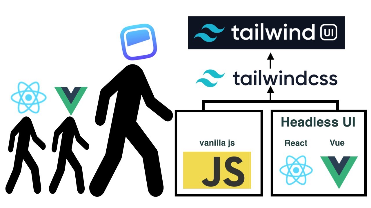
Unstyled, accessible UI components from Tailwind Labs. Built specifically to work with Tailwind CSS.
Core Purpose & Primary Use Cases
Tailwind CSS projects needing accessible interactive components. When you want design control without implementing ARIA yourself.
Perfect for developers already committed to utility-first CSS.
Component Collection
16 core components including Menu, Listbox, Combobox, Dialog, and Popover. Coverage is limited compared to full libraries.
Focus is on components where accessibility is tricky to implement correctly.
Styling Approach
Completely unstyled. Designed to work seamlessly with Tailwind classes. Components expose data attributes for styling states.
You build the markup and apply Tailwind utilities.
Developer Experience
Documentation is clear with Tailwind-focused examples. Available for React and Vue with consistent APIs.
Learning curve is gentle if you know Tailwind. TypeScript support is good.
Performance & Bundle Size
Minimal bundle impact. Each component is lightweight. Only import components you use.
No runtime style processing.
Accessibility
Implements WAI-ARIA patterns correctly. Keyboard navigation, focus management, and screen reader support work well.
Created by people who understand accessibility (Adam Wathan, Ryan Florence).
Maintenance & Community
Maintained by Tailwind Labs. GitHub stars: 26k+.
Updates are regular but conservative. The library is stable and mature.
Unique Differentiators
Purpose-built for Tailwind CSS ecosystem. Simpler API than Radix because it covers fewer use cases.
Official support for React, Vue, and (eventually) Alpine.js.
License & Pricing
MIT license. Completely free.
How Do React UI Component Libraries Work
Component libraries install via npm and import as modular pieces.
Install through package managers, import specific components, render with custom props:
npm install @mui/material @emotion/react
import { Button } from '@mui/material';
<Button variant="contained">Click Me</Button>
Each component accepts props controlling appearance, behavior, and state. The library manages internal logic, styling, keyboard navigation, and screen reader support.
Tree shaking removes unused code from your bundle. Research from Developer Way shows proper tree shaking can reduce Material UI bundles by over 30% (from 878 KB to 601 KB). Import only what you need:
- Wrong:
import _ from 'lodash'loads entire library - Right:
import debounce from 'lodash/debounce'loads one function
Theme providers wrap your application, injecting design tokens (colors, spacing, typography) through React context to every component.
What Are the Main Features of React UI Component Libraries
How Does Component Reusability Function in React UI Libraries
Components accept props for customization while maintaining consistent behavior. Write less code, ship faster, reduce bugs across your codebase.
Material UI records over 3.8 million weekly npm downloads according to NPM Trends data from 2025. Ant Design receives 1.3 million weekly downloads, while Chakra UI gets 533,000 weekly downloads.
What Role Does Theming Play in React UI Component Libraries
Theme providers inject design tokens throughout applications automatically.
Dark mode, brand colors, and custom styles propagate to all components without manual updates. Change one variable, update the entire interface.
How Do React UI Libraries Handle Accessibility
WAI-ARIA attributes, keyboard navigation, and focus management come built-in.
Libraries like React Aria and Radix UI prioritize WCAG 2.2 compliance at the component level. According to WebAIM’s analysis of one million homepages, 94.8% of websites fail basic accessibility tests. Component libraries address this gap:
Accessibility features in modern libraries:
- Keyboard navigation for all interactive elements
- Screen reader compatibility with proper ARIA labels
- Focus management across complex component trees
- Color contrast ratios meeting WCAG standards
React Aria components handle keyboard navigation, focus management, and ARIA attributes automatically so you focus on styling.
What Server-Side Rendering Support Exists
Most modern libraries work with Next.js and other SSR frameworks.
According to Vercel’s 2024 benchmarks, React Server Components in Next.js 15 can reduce client bundle sizes by 60%. An e-commerce company reported 40% faster load times and 15% higher conversion rates after migrating product pages to React Server Components.
CSS-in-JS solutions handle style extraction during server rendering, preventing layout shifts and flash of unstyled content.
SSR compatibility varies by library:
- Material UI: Full SSR support with emotion
- Chakra UI: Compatible via @chakra-ui/react
- Radix UI: Works seamlessly with Next.js App Router
- Ant Design: Built-in SSR capabilities
Next.js 15’s streaming SSR progressively renders HTML, reducing Time to First Byte and improving Core Web Vitals compared to client-side rendering.
How to Choose a React UI Component Library
What Project Size Works Best With Each Library Type
Small projects: Chakra UI, Mantine get you shipping fast.
Chakra UI records 700,000+ weekly downloads according to NPM data from January 2026. Good defaults, minimal config required.
Enterprise applications: Ant Design, MUI provide deeper component sets.
Material UI registers 3.8 million weekly npm downloads. Ant Design handles 1.4 million. Both offer extensive documentation, long-term support, and components built for data-heavy interfaces.
Custom design systems: Radix UI, shadcn/ui, Headless UI maximize control.
Radix UI primitives get 130+ million monthly aggregate downloads across packages. These headless libraries handle accessibility and behavior while you own the styling.
What Are the Performance Differences Between React UI Libraries
Bundle size directly affects load times.
According to research from Developer Way, proper implementation can reduce bundles by 30%. Radix UI paired with Tailwind CSS produces minimal bundle sizes through CSS purging and selective imports.
CSS-in-JS adds runtime overhead. Analysis from Tomas Pustelnik comparing Styled Components to build-time extraction (Linaria) on a real-world app showed:
- Runtime CSS-in-JS slows drag-and-drop interactions
- Low-end devices see noticeable performance hits
- Build-time CSS extraction eliminates runtime generation costs
Applications with 500+ components show 20-35% better performance with CSS Modules versus CSS-in-JS according to Markaicode’s 2025 analysis. Runtime CSS generation creates dynamic <style> tags, triggering style recalculations. Static CSS loads once, caches properly.
MUI and Ant Design ship larger bundles but support tree shaking for optimization. Emotion and Styled Components add 10-15KB plus runtime processing.
How Does Learning Curve Vary Across React UI Component Libraries
Chakra UI: Gentle learning curve, prop-based styling feels natural.
MUI: Moderate complexity. Extensive API surface requires time to master the theming system and component customization patterns.
Headless libraries: Steeper curve upfront, requires solid CSS knowledge. Radix UI documentation notes these are “best suited for experienced developers building scalable design systems.”
According to BrowserStack’s 2025 guide, Semantic UI React and Reactstrap rank as “beginner-friendly and intuitive” with low setup requirements. Blueprint UI and PrimeReact require more investment to understand their design systems.
What Criteria Should Guide Your Selection
Design requirements: Material Design compliance versus custom branding needs
Team experience: Familiarity with CSS-in-JS, Tailwind, or traditional CSS approaches
Component needs: Simple forms versus complex data tables and visualizations
Bundle budget: Performance constraints matter for mobile users and slower networks
Long-term maintenance: Active community, regular updates, clear migration paths
Check npm download trends, GitHub activity (commit frequency, issue response times), and release schedules before committing to which library fits your React.js project.
State of React 2024 survey shows:
- React Hook Form dominates form handling
- Motion (Framer Motion) leads animation libraries
- Chart.js tops data visualization
How to Install and Configure React UI Component Libraries
Installation follows standard npm workflows. Configuration depth varies significantly.
How to Set Up Material UI in a React Project
Install core packages:
npm install @mui/material @emotion/react @emotion/styled
Wrap your app with ThemeProvider, pass custom theme object for brand colors and typography:
import { ThemeProvider, createTheme } from '@mui/material/styles';

const theme = createTheme({
  palette: {
    primary: { main: '#1976d2' },
  },
});

function App() {
  return <ThemeProvider theme={theme}>{children}</ThemeProvider>;
}
MUI supports design tool integration. Figma kits enable pixel-perfect translation from design to code.
How to Configure Chakra UI Theming
Install dependencies:
npm install @chakra-ui/react @emotion/react @emotion/styled framer-motion
ChakraProvider at root level. Extend default theme with extendTheme():
import { ChakraProvider, extendTheme } from '@chakra-ui/react';

const customTheme = extendTheme({
  colors: {
    brand: {
      500: '#5850EC',
    },
  },
});

function App() {
  return <ChakraProvider theme={customTheme}>{children}</ChakraProvider>;
}
All 180+ Chakra components follow WCAG standards automatically. Built-in dark mode support requires minimal setup.
How to Integrate Ant Design Components
Run:
npm install antd
Import components directly, no provider required for basic usage:
import { Button, DatePicker } from 'antd';

function App() {
  return (
    <>
      <Button type="primary">Primary Button</Button>
      <DatePicker />
    </>
  );
}
ConfigProvider enables global theming. Ant Design 6.0 delivers enhanced performance and reduced bundle size. Use build automation tools for production CSS optimization.
How to Add Headless Libraries Like Radix UI
Install individual packages as needed:
npm install @radix-ui/react-dialog @radix-ui/react-dropdown-menu
No theme setup required. Components are unstyled by design:
import * as Dialog from '@radix-ui/react-dialog';

function MyDialog() {
  return (
    <Dialog.Root>
      <Dialog.Trigger className="your-button-styles">
        Open Dialog
      </Dialog.Trigger>
      <Dialog.Portal>
        <Dialog.Content className="your-dialog-styles">
          {/* Your content */}
        </Dialog.Content>
      </Dialog.Portal>
    </Dialog.Root>
  );
}
Style with Tailwind CSS, CSS modules, or your preferred approach. Radix handles ARIA attributes, keyboard navigation, focus management automatically.
What Are Common Use Cases for React UI Component Libraries
How Do E-commerce Sites Use React UI Libraries
Product grids, shopping carts, checkout forms, filters drive ecommerce functionality.
React powers 53,307 cart functionality websites according to 2025 data, including Walmart and PayPal. Ant Design and MUI provide complete ecommerce component sets with data tables, form validation, and responsive layouts.
Mobile-first responsive layouts handle product browsing across devices. State of React 2024 survey shows shadcn/ui jumped from 20% to 42% usage in one year, popular for custom-branded ecommerce.
What Dashboard Applications Benefit from React Component Libraries
Data tables, charts, sidebars, notification systems require enterprise components.
Mantine offers 123 customizable components plus 40+ hooks. Ant Design includes data visualization components with advanced table features: sorting, filtering, pagination.
According to Supernova’s 2025 analysis, Blueprint UI (developed by Palantir) excels at “building dense desktop-style interfaces” for data-heavy applications.
React’s Component Architecture delivers 60% faster development times compared to monolithic approaches according to industry analysis.
How Do SaaS Products Implement React UI Components
Form builders, settings panels, user management interfaces, billing pages need consistency.
Theme providers ensure visual coherence throughout the software development process. Material UI records 4+ million weekly downloads, making it top choice for SaaS platforms and dashboards.
Chakra UI gained 40,000+ GitHub stars and 700,000+ weekly downloads as of January 2026. Known for accessibility-first design meeting WCAG standards automatically.
What About Marketing Sites and Landing Pages
Headless libraries pair with Tailwind for custom branding.
shadcn/ui tops positivity charts at 80% in State of React 2024. Popular for marketing pages needing unique visual identity without opinionated design systems.
React powers 79 million websites worldwide according to 2025 data. Sites built with React render 15-20% faster than other JavaScript library-based websites. SSR in React delivers 20% better search engine rankings.
How Do React UI Libraries Compare to Writing Custom Components
What Are the Bundle Size Differences
Custom components: Smallest possible footprint, only code you write.
Full libraries: 50-200KB+ gzipped depending on imports and tree shaking implementation.
Headless options: 5-20KB for logic-only libraries like Radix UI.
Material UI v6 (launched late 2025) achieved 30% smaller bundle size according to development trends analysis. Proper tree shaking and code splitting critical for managing library overhead.
How Does Development Time Compare
Custom modal from scratch: 4-8 hours minimum including:
- Accessibility features (ARIA attributes, keyboard navigation)
- Animations and transitions
- Browser compatibility testing
- Focus management
Library modal: 15 minutes to implement, already tested across browsers.
According to LogRocket analysis, component libraries “guarantee consistency and reusability of UI elements both within and across digital products, all while having the potential to significantly reduce development time and effort.”
Teams practicing rapid app development benefit most. React development hourly rates range $15-25 according to DhiWise 2025 cost analysis.
What Maintenance Costs Exist for Each Approach
Libraries:
- Dependency updates (npm packages)
- Breaking changes between major versions
- Occasional code refactoring during migrations
- Learning curve for new team members
Custom components:
- Full ownership means handling every bug fix
- Accessibility updates as standards evolve (WCAG 2.2 to 3.0)
- Browser compatibility issues with each new release
- Documentation and knowledge transfer burden
According to Contentful’s analysis, “building a custom component library requires significant cross-functional, upfront effort involving design, product, and development teams.”
Simple React projects: $10,000-30,000 using component libraries Medium complexity: $35,000-80,000 Highly complex applications: $70,000-150,000
Pre-built components reduce these costs significantly by eliminating repetitive development work.
When Should You Build Custom Components
Unique interaction patterns: No existing library supports your specific UX requirements
Extreme performance requirements: Bundle size constraints demand minimal JavaScript
Radically different design system: Visual language incompatible with Material Design, Bootstrap, or other established patterns
Dedicated resources: Team has budget and expertise for long-term maintainability
LogRocket notes this approach “is mainly suitable for complex and somewhat idiosyncratic digital products, spanning across multiple web apps, and with a large enough development team.”
Consider hybrid approach: Use headless libraries (Radix UI, Headless UI) for behavior and accessibility, add custom styling. Combines library reliability with design freedom.
What Are the Limitations of React UI Component Libraries
Design Constraints
Styled libraries impose visual opinions that fight against custom branding.
Material UI apps look like Material UI apps unless you invest heavily in theme customization. According to the 2024 State of React survey, shadcn/ui jumped from 20% to 42% usage specifically because developers wanted to escape rigid design systems.
Fighting default aesthetics wastes development time. Teams spend hours overriding built-in styles when simpler solutions exist.
Bundle Size Impact
Large libraries slow initial page load, especially on mobile networks.
Material UI v6 achieved 30% bundle size reduction in late 2025 according to release notes. Even with improvements, full component libraries add 50-200KB+ gzipped to bundles.
Tree shaking helps but CSS-in-JS runtime adds overhead. Applications with 500+ components show 20-35% better performance with CSS Modules versus runtime CSS-in-JS according to Markaicode’s 2025 analysis.
Monitor with code coverage and bundle analysis tools. Webpack Bundle Analyzer and source-map-explorer reveal which components bloat your builds.
Learning Curve Variations
Each library uses unique APIs, prop naming conventions, and composition patterns.
Switching libraries mid-project requires substantial rewrite effort. Moving from MUI to Chakra UI means relearning theming systems, component APIs, and style overrides.
According to BrowserStack’s 2025 guide, MUI has “moderate complexity” with an “extensive API surface” while Chakra UI offers a “gentle learning curve” with “intuitive prop-based styling.”
Dependency Management
Major version upgrades introduce breaking changes that demand significant refactoring.
MUI v4 to v5 migration required:
- Replacing entire styling engine (JSS to Emotion)
- Updating 100+ component imports (package name changed from @material-ui to @mui)
- Refactoring theme structure with adaptV4Theme helper
- Running codemods to handle automated changes
- Minimum React version bump from 16.8.0 to 17.0.0
- TypeScript version increase from 3.2 to 3.5
According to MUI’s 2024 update, “almost a million users have successfully migrated” to v6 since August 2024 release. Migration complexity varies by codebase size.
Lock versions in production, schedule regular dependency audits, plan upgrade cycles alongside your software release cycle.
Customization Boundaries
Some components resist deep modification. Internal implementation details limit flexibility.
LogRocket analysis notes that component libraries can become constraints: “Building a component library requires significant cross-functional, upfront effort” but “certain React components are notoriously difficult to create from scratch.”
Headless libraries (Radix UI, Headless UI, React Aria) solve this by separating behavior from presentation. You own styling completely while the library handles accessibility and keyboard navigation.
Trade-off: More upfront styling work versus fighting against opinionated designs.
Accessibility Gaps
Not all libraries achieve full WCAG 2.2 compliance despite claims.
WebAIM’s 2025 analysis of one million homepages found:
- 94.8% of websites have accessibility failures
- Average homepage contains 51 WCAG violations
- Automated tools detect only 40% of accessibility issues according to AllAccessible
Library accessibility varies significantly:
React Aria and Radix UI lead in accessibility with WCAG 2.2 compliance built-in. According to Untitled UI’s 2026 analysis, these libraries “go further with WCAG compliance and accessibility best practices baked in.”
Chakra UI, MUI, and Ant Design claim WCAG compliance but require proper implementation. KendoReact targets WCAG 2.2 and WAI-ARIA 1.2 with dedicated accessibility professionals.
Test with screen readers regardless of library claims. Automated accessibility tools (axe DevTools, WAVE) catch some issues but manual testing with VoiceOver (Mac) or NVDA (Windows) reveals remaining 60-70% of problems.
Digital accessibility lawsuits exceeded 4,500 in 2024 according to 2025 web accessibility guides. ADA compliance requires WCAG 2.2 Level AA, which includes 6 new Level AA criteria beyond WCAG 2.1.
Implementation gaps occur when:
- Developers skip ARIA labels on custom implementations
- Keyboard navigation breaks in complex component compositions
- Focus management fails during modal interactions
- Color contrast ratios fall below 4.5:1 minimum
Production apps need more than assumptions. According to Builder.io’s 2026 guide, “96% of top websites have accessibility errors” despite using component libraries.
FAQ on React UI Component Libraries
What Is the Best React UI Component Library for Beginners?
Chakra UI offers the gentlest learning curve. Its prop-based styling feels intuitive, documentation is excellent, and default components look good immediately. Mantine is another solid choice with similar accessibility and comprehensive technical documentation.
Are React UI Libraries Free to Use?
Most popular libraries are open source and free. Material UI, Chakra UI, Ant Design, Radix UI, and Mantine all use MIT licenses. Some offer paid templates or premium components, but core functionality costs nothing.
How Do I Add Dark Mode With React Component Libraries?
Most libraries include built-in dark mode support. Chakra UI and Mantine provide useColorMode hooks. MUI uses theme palette configuration. Toggle between modes by updating the theme context value in your provider component.
Can I Use Multiple React UI Libraries Together?
Technically yes, but not recommended. Different styling approaches conflict, bundle sizes bloat, and visual inconsistency emerges. Pick one primary library. Use headless components from Radix UI if you need specific functionality your main library lacks.
Which Library Has the Smallest Bundle Size?
Headless UI and Radix UI add minimal weight since they ship no styles. Among styled options, Chakra UI and Mantine are lighter than Ant Design or MUI. Tree shaking reduces impact when you import selectively.
Do React UI Libraries Work With Next.js?
Yes. MUI, Chakra UI, Mantine, and Ant Design all support Next.js server-side rendering. Some require additional configuration for CSS extraction. Check each library’s SSR documentation for specific setup instructions.
How Do I Customize Component Styles Beyond Theming?
MUI offers the sx prop and styled() API. Chakra UI uses style props directly on components. Ant Design supports CSS overrides and ConfigProvider. Headless libraries accept any styling solution: Tailwind, CSS modules, or styled-components.
Are These Libraries Accessible Out of the Box?
Quality varies. Radix UI and React Aria prioritize WAI-ARIA compliance extensively. MUI and Chakra UI include solid accessibility defaults. Always test with screen readers regardless of library claims, especially for complex interactive components.
What Happens When a Library Gets Deprecated?
Migration becomes necessary. MUI v4 to v5 required significant code changes. Using headless libraries like Radix UI reduces this risk since your styling remains independent. Evaluate community activity and semantic versioning practices before committing.
Should I Use a Component Library or Build Custom Components?
Libraries save time on standard UI patterns: modals, dropdowns, forms. Build custom when you need unique interactions or extreme performance optimization. Most teams combine both approaches based on specific feature requirements.
Conclusion
React UI component libraries eliminate repetitive interface work and let you focus on what makes your application unique.
MUI and Ant Design suit enterprise dashboards. Chakra UI and Mantine work well for teams wanting fast iteration. Headless options like Radix UI and shadcn/ui give complete styling control.
Your choice depends on project scope, design requirements, and team familiarity with specific React component patterns.
Test bundle sizes before committing. Check TypeScript support if your tech stack requires it. Evaluate accessibility compliance with real screen reader testing.
No library is perfect for every situation. Pick one that aligns with your constraints, learn its API thoroughly, and build something great.
Many of his resources are available on various design marketplaces and for free on Codepen.
Over the years, he's worked with a range of clients and contributed to design publications like Design Your Way, Designmodo, WebDesignerDepot, WPDean, Speckyboy, and Slider Revolution among others.
- How to Make a Repository Public in GitHub - July 14, 2026
- Production Incident Communication Without Separate Monitoring and Status-Page Systems - July 13, 2026
- How to Set Up Subscriptions on Google Play (Developer Guide) - July 12, 2026


