Upload the wrong file and Google Play Console rejects your app before any human ever sees it.
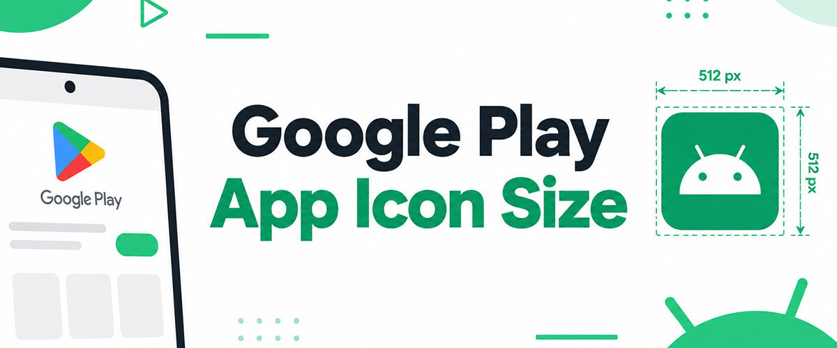
The Google Play app icon size has strict technical requirements: exactly 512 x 512 pixels, 32-bit PNG format, under 1024 KB. One pixel off triggers an automatic error.
But the spec is just the start. Your store listing icon also affects search result click-through rates, conversion on your app listing page, and whether Google’s dynamic masking clips your design.
This guide covers every dimension, format rule, and design constraint you need, including how the store icon differs from your Android launcher icon, what causes rejections, and how to test before submission.
What Is the Google Play App Icon Size?
The Google Play app icon size is 512 x 512 pixels, uploaded as a 32-bit PNG with a maximum file size of 1024 KB.
This is the store listing icon only. It lives on your Google Play listing page and appears in search results, top charts, and category pages. It is not the same asset as the launcher icon that appears on a user’s home screen after installation.
Google Play handles all visual processing after upload. Rounded corners and drop shadows are applied automatically by the platform, so your uploaded file must be a clean, flat, full-bleed square with no pre-applied effects.
Starting March 31, 2026, Google dynamically applies a 30% corner radius to all store icons. Developers who baked custom rounding into their assets before this change now have duplicate rounding applied, which creates visual distortion in the listing. Upload a clean square. Let Google handle the mask.
| Specification | Requirement |
|---|---|
| Dimensions | 512 × 512 px (exact) |
| File format | 32-bit PNG only |
| Maximum file size | 1024 KB |
| Color mode | RGB or RGBA (transparency allowed) |
| Rounded corners | Applied automatically by Google Play, not by the developer |
The 512 x 512 asset is uploaded through the “Store presence” section of Google Play Console, not bundled inside your APK or AAB. If you upload to the wrong location, the asset either gets rejected or simply does not appear on your listing.
What Is the Difference Between a Google Play Store Icon and an Android Launcher Icon?
These two assets serve completely different purposes and live in completely different places. Confusing them is one of the most common mistakes in Android development.
The store listing icon (512 x 512 px) is what users see when browsing Google Play before downloading your app. The launcher icon is what appears on a user’s device home screen and app drawer after installation. They are separate assets, uploaded through separate workflows.
| Asset | Size | Location | Used For |
|---|---|---|---|
| Store listing icon | 512 × 512 px PNG | Google Play Console → Store presence | Search results, app listing pages, and top charts |
| Launcher icon (adaptive) | 108 × 108 dp layers | Inside the APK/AAB (res/mipmap folders) | Device home screen, app drawer, and system settings |
Android Adaptive Icon Requirements
Adaptive icons were introduced in Android 8.0 (API 26) and are now the standard for launcher icons across the Android ecosystem.
An adaptive icon consists of 2 separate layers, each sized at 108 x 108 dp: a foreground layer (your logo or symbol) and a background layer (solid color, gradient, or pattern).
- Safe zone: The inner 66 x 66 dp area is guaranteed visible on all mask shapes. Keep all critical artwork here.
- Outer 18 dp on each side may be clipped by device-specific masks (circle, squircle, rounded square).
- Background layer must be fully opaque. Foreground layer may include transparency.
- Android 13+ supports a monochrome layer for themed icons that match the user’s wallpaper tint.
Launchers apply different shapes depending on the device manufacturer. Samsung devices often use squircles. Stock Android typically defaults to rounded squares. Your foreground artwork must work cleanly inside the safe zone regardless of which mask gets applied at runtime.
Where Each Icon Is Uploaded in Google Play Console
This trips up a lot of developers who are new to the software development process for Android apps.
Store listing icon: Upload under “Store presence” then “Main store listing” in Google Play Console. This is the 512 x 512 PNG.
Launcher icons: Bundled directly inside your APK or AAB files inside the res/mipmap-* folders. Android Studio’s Image Asset Studio generates these automatically across all required density buckets.
One does not replace the other. You need both. A listing without a store icon cannot be published. An app without a launcher icon will not display correctly on device after installation.
What Are Google’s Technical Requirements for the Play Store Icon?
Google enforces these specifications at upload time inside Play Console. An off-spec file gets rejected immediately, before any human review takes place.
Format: PNG only. JPG, WebP, GIF, and SVG are not accepted for the store icon upload field.
- Dimensions: Exactly 512 x 512 pixels. One pixel off triggers an error.
- Bit depth: 32-bit (supports alpha channel). Standard 24-bit PNG is not sufficient.
- File size: Maximum 1024 KB. Compress without sacrificing visible quality.
- Color profile: sRGB. This is the standard color space used across most Android devices and browsers.
Transparency is allowed. If your icon uses a transparent background, Google Play will display the Play Store’s own UI background color behind it. For brand consistency, most developers use a solid color background that matches their app’s visual identity.
Google applies the rounded corner mask automatically. Do not add rounded corners to the uploaded file. As of March 2026, the applied corner radius is equivalent to 30% of the icon size.
Original icon assets uploaded under the pre-2019 specification were migrated to “legacy mode” and scaled down to 384 px (512 x 0.75). Uploading under the old specification has not been permitted since May 2019. If your icon looks soft or slightly blurry in the Play Console preview, this legacy scaling is likely the cause. Upload a fresh 512 x 512 asset to resolve it.
How Does Google Play Display the Store Icon Across Different Surfaces?
The 512 x 512 asset you upload is not displayed at that resolution anywhere. Google scales and crops it for every surface where your app appears.
According to Google Play’s own icon design documentation, your app icon appears in 3 main contexts on the store: your store listing page, search results, and top charts. Each context renders the icon at a different size, which is why readability at small rendered sizes matters more than the quality of fine detail in the full 512 x 512 canvas.
Icon Display on Mobile Play Store
In search results, your icon renders at roughly 48 x 48 pixels on an mdpi screen. At that size, complex logos, fine text, and multi-element compositions become unreadable.
Always test your icon at 48 px. If the core symbol is not immediately recognizable at that size, the design needs simplifying. That 48 px moment is the one that drives the tap decision in organic search.
Google Play also renders icons in dark mode. A white or very light icon background that looks clean on a white Play Store background can appear blown out or lose contrast entirely when the store switches to dark mode. Test both appearances.
Icon Display on Android TV
Android TV does not use the 512 x 512 store icon as the primary display asset. Instead, it uses a banner image at 320 x 180 pixels (16:9 aspect ratio) to represent your app in the TV launcher row.
The store icon is still required in Play Console for TV apps, but the banner is what users see in the “Your apps” row and in search results on TV. Text must be included in the banner image because TV context assumes the viewer is further from the screen.
Adaptive banners for Android TV also follow the 2-layer (foreground/background) structure, similar to adaptive launcher icons on mobile. A 72 x 72 dp safe zone applies for TV adaptive banners as well.
Icon Display on Wear OS
Wear OS enforces a circular crop on all app icons, which makes safe zone discipline more critical than on mobile or TV.
The standard 512 x 512 store icon is still required for Wear OS apps in Play Console. But the actual display on the watch face uses the launcher icon with a strict circular mask. Any design elements sitting outside the circular safe zone get clipped. Logo marks with wide horizontal proportions are especially tricky here because the circle cuts the sides before any corner rounding does.
What Are the Design Specifications Google Recommends for a Play Store Icon?
Google’s design guidance goes beyond file specs. The official Material Design principles apply to the visual structure and content of your store icon, not just its technical format.
With over 2.3 million apps available on Google Play as of Q2 2024 (Statista), standing out in a search result row comes down to icon clarity and recognizability at small sizes. Overly complex icons are nearly invisible when rendered at 48 px.
Content and Visual Rules
No text in the icon is Google’s strong recommendation (not a hard rejection rule, but consistently advised). Text becomes illegible at small display sizes and reduces the visual impact of the brand mark.
- No badges, ranking indicators, or text implying “Best App,” “#1,” or similar claims
- No visual elements that suggest special offers, discounts, or pricing
- No Android robot imagery or Google branding without authorization
- No graphics that could imply Google Play program participation
Violating content rules does not always trigger automated rejection. But it does lead to manual review and potential removal post-publication, which disrupts your store listing. Google’s metadata policy covers icon content as well as textual metadata.
Visual Balance and Readability
Google’s guidelines recommend 15 to 18% internal padding around key design elements. With the March 2026 update applying a 30% corner radius dynamically, any artwork pushed to the edges of the 512 x 512 canvas risks getting clipped visually even before it gets cropped down to small display sizes.
High contrast between the icon’s main symbol and background is more important than visual complexity. Apps like Google Maps, Spotify, and WhatsApp use simple shapes with bold, high-contrast color choices. Their icons are still instantly recognizable at 48 px because the core symbol reads as a clear shape, not a collection of fine details.
Color consistency between the store icon and the in-app UI also builds trust. A user who downloads an app expecting the blue-and-white branding from the store icon should find the same palette when they open the app. Inconsistency here reads as low quality and increases uninstall rates.
What Causes a Google Play Icon to Be Rejected?
Play Console rejects icons both automatically (at upload) and manually (during app review). The two categories have different causes.
Automatic rejections at upload are always technical. The file spec is wrong, the dimensions are off, or the format is not accepted. These are immediate, with no human involvement. Fix the file and re-upload.
Technical Rejection Triggers
These cause immediate upload failure in Play Console without any review queue.
- Dimensions anything other than exactly 512 x 512 pixels
- File size exceeding 1024 KB
- Format other than PNG (including PNG files saved with a JPG color profile)
- 24-bit PNG instead of 32-bit
Policy Rejection Triggers
These surface during manual review and can result in app removal even after initial publication.
Misleading quality claims: Any icon that includes badges, star ratings, or ranking numbers violates Google’s metadata policy. This includes subtle design choices like small “award ribbon” graphics or subtle “#1” typography embedded in the design.
Trademarked imagery: Using the Android robot, Google logo elements, or other protected brand marks without authorization is a policy violation with account-level consequences, not just listing-level ones.
Policy-violating content: Icons containing sexually suggestive imagery, graphic violence, or content that violates Google Play’s developer policies are removed and can result in account suspension. Google Play removed approximately 700,000 apps for non-compliance in 2025 (Tekrevol), and icon policy violations are among the flagged reasons.
One thing worth noting: an icon that passes initial review can still be flagged later. Google periodically runs policy sweeps across existing listings, and icons that were published years ago under more lenient enforcement can surface for removal when policies tighten.
How Do You Create a 512 x 512 Google Play Icon?
The tools that produce the best results for Google Play store icons are the same ones used for general UI/UX design work: Figma, Adobe Illustrator, and Sketch. Each exports clean 512 x 512 PNGs with the right color profile when set up correctly.
One common mistake: using Android Studio’s Image Asset Studio to create the store icon. Image Asset Studio generates launcher icons (the adaptive foreground/background layer assets for the APK). It does not produce the 512 x 512 PNG for the Play Console store listing. These are different tools for different assets.
Exporting from Figma
Figma is probably the most widely used tool for this in 2025. The export setup is straightforward, but the settings matter.
- Set up a frame at exactly 512 x 512 pixels
- Export as PNG at 1x scale (not 2x or 3x)
- Select “PNG” in the export panel, not “SVG” or “PDF”
- Check the file size after export. Figma’s default PNG compression sometimes produces files over 1024 KB for complex illustrations.
If the exported file exceeds 1024 KB, use a tool like TinyPNG or Squoosh to compress it. Lossy PNG compression at 80-90% quality typically brings file size under the limit without visible quality loss at store display sizes.
Exporting from Adobe Illustrator
Illustrator is the right tool if your icon is built from vector paths, especially for logos with precise geometry.
Setup: Create a new document with an artboard at 512 x 512 px. Set the color mode to RGB (not CMYK). Set the color profile to sRGB IEC61966-2.1.
Export: Use “Export for Screens” (not “Save for Web” and not “Export As”). Select PNG format, scale 1x, resolution 72 PPI. The “Export for Screens” path preserves the sRGB profile correctly, while “Save for Web” can strip it.
After export, verify the file is under 1024 KB and open the PNG in a viewer to confirm the colors look correct. Illustrator occasionally shifts colors slightly when converting from an RGB working space to sRGB during export.
Exporting from Sketch
Sketch handles this cleanly. Set the artboard to 512 x 512 px, then use the Export panel in the bottom right to add a PNG export at 1x.
Sketch’s PNG exports are generally well-compressed and rarely exceed 1024 KB for typical icon designs. The exception is icons with complex gradients or photographic elements embedded in the design. Check the file size before uploading.
Worth mentioning: Canva can produce a 512 x 512 PNG, and some developers use it for quick iterations. The output quality is acceptable for simple designs. For anything with precise brand colors or complex geometry, Figma or Illustrator will give more consistent results. Canva’s export pipeline applies its own JPEG-style compression to PNGs at higher complexity, which can introduce subtle color banding around gradient edges.
How Does the Google Play Icon Affect Conversion Rate on the Store Listing?

The icon is the first visual element users see in search results. On Google Play, it is often the only visible asset before a user taps to open the listing page.
AppTweak data shows the average Google Play store listing conversion rate in the U.S. was 27.3% in the first half of 2024. Even a 2 to 5 percentage point improvement from an icon change can significantly shift monthly install volume, especially for apps with high organic search traffic.
According to AppTweak’s 2025 ASO trends report, 90% of featured apps on Google Play had a rating of 4.0 or higher, and the majority of top apps did not change their icon or title despite these having measurable impact on rankings. That gap is an opportunity for teams willing to test.
How Icon Design Affects Click-Through in Search
Your icon sits next to the app title and rating in search results. At that point, the listing has roughly 48 px of rendered icon space to work with.
- Simple, bold shapes outperform complex compositions at small sizes
- High contrast between symbol and background improves recognition in 0.3-second scan windows
- Color uniqueness within your category matters more than color “correctness”
PressPlay’s 2026 analysis of Google Play A/B test data shows icon changes produce 5 to 15% conversion swings, making the icon one of the highest-leverage assets to test on a store listing.
How to Use Store Listing Experiments to Test Your Icon
Google Play Console includes a built-in A/B testing tool called Google Play store listing experiments. This is a native feature, free to use, and runs on live store traffic.
Setup process:
- Go to “Store presence” then “Store listing experiments” in Play Console
- Select “Hi-res icon” as the attribute to test
- Upload up to 3 variants alongside your current icon
- Set audience split (50/50 for 2 variants is standard)
- Run for at least 7 days to cover both weekday and weekend traffic patterns
Google’s own guidance recommends testing one asset at a time. If you change the icon and screenshots simultaneously, you cannot tell which drove the result. Test the icon alone first.
What Counts as a Statistically Valid Icon Test
PressPlay’s 2026 guide recommends waiting for at least 90% confidence in Play Console before applying a winner. For higher-stakes permanent changes, 95% is more reliable.
Key mistake to avoid: stopping a test after 24 to 48 hours because one variant looks ahead. Early results are often noise. Weekend user behavior differs from weekday behavior. A variant that leads on Thursday often loses its edge by Sunday.
AppTweak’s 2025 report found that 57% of top Google Play games A/B tested screenshots at least twice in 2024. Apps lagged behind, with fewer repeat tests. Developers who iterate on icon testing multiple times per year consistently rank higher than those who set and forget.
What Are the Icon Size Requirements for Other App Stores Compared to Google Play?
If you are doing cross-platform app development, the Google Play 512 x 512 asset is not enough on its own. Each store has different dimensions, format rules, and transparency policies.
| Store | Required Size | Format | Transparency |
|---|---|---|---|
| Google Play | 512 × 512 px | 32-bit PNG | Allowed (RGBA) |
| Apple App Store | 1024 × 1024 px | PNG | Not allowed (must be fully opaque) |
| Amazon Appstore | 512 × 512 px and 114 × 114 px | PNG | Allowed |
Apple App Store vs Google Play Icon Requirements
Apple requires a 1024 x 1024 px PNG master file with zero transparency. Any transparent pixel causes automatic rejection. Google allows transparency (RGBA) and requires exactly 512 x 512 px.
Key difference: Apple applies a “squircle” rounded corner mask. Google applies a 30% corner radius mask (as of March 2026). Neither store wants the developer to pre-apply rounding. Both handle masking dynamically after upload.
Starting your design at 1024 x 1024 and scaling down to 512 x 512 for Google Play gives you the cleanest cross-platform workflow. Design once at the larger size, verify readability at 512 px, then export both files separately with the correct transparency settings for each store.
Amazon Appstore Icon Requirements
Amazon requires 2 icon assets, not one: a 512 x 512 px large icon and a 114 x 114 px small icon, both in PNG format. The small icon is used for thumbnail display contexts, while the large icon covers the primary listing placement.
Both icons support transparency. Amazon’s official developer documentation states the small icon can be a simplified version of the large icon or an identical design scaled down, but it must be designed for readability at thumbnail size, not simply resized from the 512 px asset.
This matters practically: a 512 x 512 design with fine detail or thin lines will look blurry and indistinct when mechanically scaled to 114 px. Amazon specifically warns against scaling up a PNG and resubmitting a blurry result. Design the small icon separately or at minimum verify it at target size before submitting.
Samsung Galaxy Store and Huawei AppGallery Icon Specs
Samsung Galaxy Store requires a 512 x 512 px PNG icon for the standard mobile app listing, making it directly compatible with your Google Play asset. No additional work is needed for this specific requirement.
Huawei AppGallery has different constraints. The icon must be a PNG or WebP file with a maximum file size of 2 MB. Huawei AppGallery had exceeded 580 million monthly active users as of its last publicly reported milestone, making it a meaningful secondary distribution channel for apps targeting markets where Google services are unavailable.
For teams doing mobile application development targeting both Google Play and Huawei AppGallery, the same 512 x 512 PNG often works directly for AppGallery submission with no resizing required, assuming the file size stays under 2 MB.
How Do You Test a Google Play Icon Before Submission?

Testing before upload avoids two problems: technical rejection in Play Console, and visual issues that only appear at rendered display sizes on real devices.
Most icon problems are invisible at full canvas size and only surface at 48 px. Running a pre-submission check takes about 10 minutes. Skipping it costs days if you discover issues after uploading to an internal test track.
Technical Validation Before Upload
Run these checks on the exported file before opening Play Console.
File spec checks:
- Confirm dimensions are exactly 512 x 512 px using your OS file inspector or image editor
- Confirm format is PNG, not a renamed JPG
- Confirm bit depth is 32-bit (check via image editor properties, not just file size)
- Confirm file size is under 1024 KB
The 32-bit vs 24-bit check is the most commonly skipped. Some design tools default to 24-bit PNG on export. Figma’s standard PNG export is 24-bit unless you specifically enable the alpha channel in your export settings. A 24-bit PNG uploads to Play Console without an error message but does not meet the format specification.
Visual Testing at Small Display Sizes
Open your 512 x 512 PNG in any image viewer and manually resize the preview window to simulate display at 48 px and 72 px. If the core symbol breaks down into an unrecognizable blob at those sizes, the icon design needs simplification before upload.
Use Android Studio’s emulator to check the launcher icon (not the store icon) on a simulated device. The Android Studio emulator lets you preview how the adaptive icon renders across different mask shapes (circle, squircle, rounded square) without needing physical hardware.
For the store icon specifically, Play Console shows a preview of how your icon will appear on the listing page after upload. Check that preview carefully against both light and dark Play Store backgrounds. Google Play supports a dark mode that flips the store UI to a near-black background. An icon with a white or very light background can look washed out or lose edge definition in dark mode.
Device Testing Before Publishing
Upload to an internal test track first. This makes the app available to internal testers without a public listing, so you can verify how the icon appears in actual search results on a real Android device.
Check the icon on at least 2 different screen densities. A Samsung Galaxy S24 (xxxhdpi) and a mid-range device like a Moto G (hdpi) will render the icon differently. The xxxhdpi rendering will look sharper with fine details visible. The hdpi device will compress those details aggressively. If the icon only looks correct on high-end hardware, it needs simplification.
The Android SDK tools include the Device File Explorer, which lets you inspect how icon assets are cached on a connected device or emulator after installation. This is useful for confirming that the correct density bucket is being served to each device class during testing.
FAQ on Google Play App Icon Size
What is the required Google Play app icon size?
The required size is exactly 512 x 512 pixels. The file must be a 32-bit PNG with a maximum size of 1024 KB. One pixel off triggers an automatic rejection in Google Play Console. No exceptions.
Can I upload a JPG instead of a PNG for my Play Store icon?
No. Google Play only accepts PNG format for the store listing icon. JPG, WebP, SVG, and GIF are all rejected at upload. The file must also be 32-bit, not standard 24-bit PNG.
Does Google Play apply rounded corners automatically?
Yes. As of March 2026, Google dynamically applies a 30% corner radius to all store icons. Do not add rounded corners to your uploaded file. Double rounding creates visible distortion on your listing.
What is the difference between a store icon and a launcher icon?
The store icon (512 x 512 px PNG) appears on Google Play before download. The launcher icon appears on the user’s home screen after installation. They are separate assets uploaded in different locations inside Play Console.
Can my Google Play icon have a transparent background?
Yes. Transparency is allowed. The file supports RGBA color mode. If the background is transparent, Google Play displays its own UI background color behind the icon. Most developers use a solid brand color instead.
What happens if my icon file exceeds 1024 KB?
Play Console rejects the upload immediately. Use a PNG compression tool like TinyPNG or Squoosh to reduce file size. Compressing at 80 to 90% quality typically brings the file under the limit without visible quality loss.
What safe zone padding should I use for my Play Store icon?
Google recommends 15 to 18% internal padding around key design elements. With the 30% corner radius applied dynamically, artwork pushed to canvas edges risks visual clipping. Keep logos and symbols well inside the center of the 512 x 512 canvas.
Is the Google Play store icon the same as the Android adaptive icon?
No. Adaptive icons are two-layer assets (foreground and background at 108 x 108 dp) bundled inside your APK for on-device display. The store icon is a flat 512 x 512 PNG uploaded separately through Play Console.
How do I test my icon before submitting to Google Play?
Preview your icon at 48 x 72 px to check small-size readability. Upload to an internal test track first. Check rendering in both light and dark Play Store modes. Verify the file is exactly 512 x 512 px and under 1024 KB before submission.
How does the Google Play icon size compare to the Apple App Store?
Apple requires a 1024 x 1024 px PNG with no transparency. Google requires 512 x 512 px with transparency allowed. Apple rejects any icon with an alpha channel. Both stores apply corner masking automatically after upload.
Conclusion
This conclusion is for an article presenting the full picture of Google Play app icon size, from the 512 x 512 px PNG specification to adaptive icon layers, store listing conversion impact, and cross-platform asset differences.
Get the file format, bit depth, and pixel dimensions right first. Everything else builds on that foundation.
Beyond the technical specs, your icon’s display size in search results, its behavior under Google Play’s dynamic corner radius masking, and its performance in Store Listing Experiments all affect how many users tap through to your listing.
Design for 48 px. Test before you publish. Iterate based on data, not assumptions.

- MongoDB Cheat Sheet - October 20, 2026
- Adding AI Video Generation to a Software Product: Architecture, Cost Guardrails and QA - October 20, 2026
- Show Hidden Characters, Spaces, and Line Endings in Notepad++ - October 19, 2026