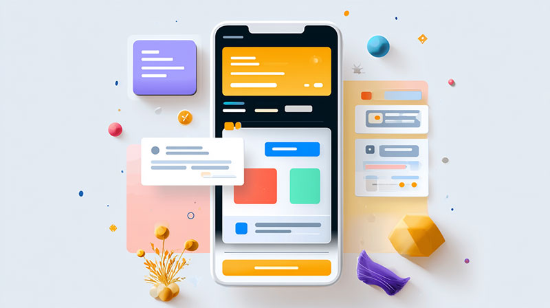
Open almost any banking app and you can predict the experience before it finishes loading: a wall of navy blue, a row of rounded rectangles, a stock photo of someone grinning at a laptop. Safe. Forgettable. Cash App went the other way. What they built looks more like a game launch than a banking app. Neon, three-dimensional, loud, and quietly moving real money for millions of people, day after day.
That tension is the whole story. A payment service has to be trusted before it is allowed to be fun, yet Cash App pulls off both at once. Its design language borrows the energy of video games, with collectible-looking icons, springy motion, and glowing color, then aims all of it at something dependable and fast. It’s all there in Cash App’s UI guidelines. One visual system, working across web and mobile, and it never gets watered down.
What holds it together is engineering discipline wearing a costume. The foundations go right down to the atomic level. Design tokens and reusable components mean teams can ship fast, and every screen still stays on-brand. Speed, multiplatform support, and durability were priorities from the first sketch, not afterthoughts bolted on later. The payoff is a product that loads quickly, behaves the same in a browser as it does on a phone, and rarely forces anyone to relearn how a familiar screen works.
Core Foundations
Every durable system rests on a handful of design foundations that almost never change. For Cash App, those anchors are typography, color, and illustration, the three layers that do most of the heavy lifting.
Typography: Cash Sans
The brand runs on Cash Sans, a typeface they drew for the product themselves instead of licensing one off the shelf. It is tidy enough for a balance sheet and characterful enough for a billboard. The type scale works more like a creative tool than a strict grid. Designers can go big and bold with headlines, the kind of thing you’d see in a game rather than a contract, and still count on the smaller text staying clean and readable.
Color System
Then there is the green. Cash App took its signature shade and cranked it into something close to digital phosphor: a hyper-neon green that practically hums against dark and neutral surfaces. The color system balances that electric accent with restrained, high-contrast backdrops, so the palette reads as high-energy without tipping into chaos. It behaves like a power-up: instantly recognizable and impossible to scroll past.
3D Illustration
The most overtly game-like layer is the iconography. Cash App commissioned an entire 3D illustration library of more than 650 icons and assets, shipped with source files and its own 3D brand guidelines so nothing drifts out of style. The icons lean on metaphor and charm instead of literal clip-art, so a stack of coins or a little vault reads like something you’d unlock mid-level. That expressive imagery turns a dull task, like sending a friend ten dollars, into a small hit of delight.
Motion and Spatial Experience
If the foundations decide how Cash App looks, custom motion decides how it feels.
The brand portal itself behaves like a playable space. There’s no static gallery here. You poke around the icons in a grid where everything floats, spins, and reacts to your cursor, so it feels closer to scrolling an inventory screen than reading a manual. That playful, explorable feel runs through the whole product.
Inside the app, motion is doing real work, not just showing off:
- Bold transitions mark the moments that matter, like a payment clearing or a card switching on.
- Micro-animations and haptics acknowledge every tap and swipe, so the surface feels responsive and alive.
- Layered 2D and 3D objects add depth and quietly steer attention toward the next action.
The motion style deliberately blends bold confidence with playful levity. It is animated enough to feel current, restrained enough that nobody is ever waiting on a flourish before their money moves. Cash App even tucks a design-integrated assistant, Moneybot, into the same world, a hint at how intelligent automation can live inside an expressive shell without cracking it.
Usability, Accessibility, and Security
Play is only half the brief. The other half is making sure a first-time user, or someone with low vision, never feels lost. This is where the system’s commitment to human-centered design and radical clarity earns its keep.
Designed to Be Read by Everyone
High-Contrast Backgrounds and Bold Type
Cash App leans hard on high-contrast pairings: heavy white type set against saturated green or deep gray. The choice looks striking, but it is also a deliberate accessibility decision. Strong contrast and bold weights make information easier to read for users with visual impairments, and they keep critical figures legible whether you are in direct sunlight or a dark room.
Bubbly, Rounded Edges
Look closely and almost nothing has a sharp corner. Buttons, input fields, and cards all carry soft, “bubbly” rounded edges. The curves do more than set a mood. They give you clear, tappable targets and point to where the action is, which makes things easier for first-time users. The interface feels approachable, almost toy-like, without ever reading as unserious.
It helps to see how each borrowed game-world idea maps onto a concrete financial job:
| Video-game technique | Job it does in Cash App |
| Collectible-style 3D icons | Make routine money tasks feel rewarding |
| Explorable, zoomable portal | Encourage discovery and engagement |
| Hyper-neon color, bold contrast | Aid readability and accessibility |
| Rounded, “bubbly” controls | Lower the learning curve, invite taps |
| Responsive motion and haptics | Confirm actions and build confidence |
Security That Stays Out of the Way
None of the polish would count for anything if the app felt unsafe. Cash App keeps its protections, things like multi-factor authentication and end-to-end encryption, running quietly under the hood instead of up front. They’re always on, but they don’t crowd the screen or interrupt a transfer. That’s the balance a payment app needs: serious infrastructure beneath a playful surface. And the quiet reliability that comes out of it is a big part of why people actually trust it with their money. Trust here is something you feel in passing, not something you go hunting for in a settings menu.
Why It Matters Beyond Cash App
Cash App settles an argument a lot of fintech teams are still having: a money product can be expressive and rigorous at the same time. The bright asset libraries, the electric green, and the floating icons: none of it undermines the trust the service depends on. If anything, the personality makes people more willing to lean in. The lesson is portable. Clear hierarchy, consistent tokens, and a little character can coexist, and the brands that figure that out tend to be the ones people actually enjoy using.
For anyone who wants to study how that balance is actually struck, DesignSystems Surf is one of the best places to start. Its breakdown of the Cash App system gathers the core foundations (color, motion, typography, illustration, voice and tone) in a single view, each linked back to the source. It’s a really useful reference, both for the specifics of Cash App’s setup and for the broader question of how modern fintech apps build a coherent design language. More than anything, it’s a reminder that financial software doesn’t have to be dull to be trustworthy.

- How to Share GitHub Repository Access With Collaborators - October 25, 2026
- Streamlining Client Projects: Modern Cloud ERP Solutions - October 25, 2026
- Build or Buy an AI Chatbot for E-commerce: The Costs Nobody Budgets For - October 24, 2026