One wrong pixel dimension and your entire app submission stalls. Google Play Store screenshot sizes follow strict rules for every device type, from phones to Wear OS watches to Android XR headsets.
Get them wrong, and Play Console rejects your upload. Get them right, and your listing looks sharp across every Android screen.
This guide covers the exact pixel dimensions, aspect ratios, file format rules, and upload limits for every device Google Play currently supports. You’ll also learn how screenshots display across different store surfaces, what recent Play Console changes affect your listings, and how to avoid the most common rejection mistakes.
What Are Google Play Store Screenshot Sizes?

Google Play Store screenshot sizes are the specific pixel dimensions, aspect ratios, and file format rules that Google requires for every image uploaded to an app’s store listing in Play Console.
Get them wrong, and your submission gets rejected. Get them right, and your app looks sharp on every Android device out there.
The baseline rules are straightforward. Every screenshot must fall between 320 pixels minimum and 3,840 pixels maximum on any side. The max dimension can’t be more than twice the min dimension, which effectively caps you at a 2:1 aspect ratio. Files must be JPEG or 24-bit PNG with no alpha transparency, and each image can’t exceed 8 MB.
You need at least 2 screenshots for phones and can upload up to 8 per device type. For tablets and Chromebooks, publishing your app on Google Play requires a minimum of 4 screenshots if your app targets those form factors.
Statista data from Q2 2024 shows over 2.26 million apps were available on the Google Play Store. That’s a lot of competition for screen real estate, and screenshots are often the first visual a user evaluates before tapping “Install.”
ASO research indicates that optimized screenshots can produce around a 24.3% uplift in conversion rate on Google Play (The App Launchpad). So the pixel specs aren’t just technical busywork. They directly affect whether people download your app.
Unlike the Apple App Store, Google doesn’t enforce rigid resolution requirements per device model. Instead, Google automatically scales and categorizes your uploads to fit different screens. But. If you want a shot at being featured in curated collections or recommended listings, your screenshots need to meet Google’s recommended specs, not just the minimum.
How Google Play Screenshot Sizes Differ from Apple App Store
| Spec | Google Play Store | Apple App Store |
|---|---|---|
| Min screenshots | 2 (phones) | 1 |
| Max screenshots | 8 per device type | 10 per device type |
| Resolution rules | Flexible (320–3840 px range) | Fixed per device model |
| Aspect ratio | Max 2:1 ratio enforced | Must match exact device ratios |
| File format | JPEG or 24-bit PNG (no alpha) | JPEG or PNG |
| Search result visibility | Screenshots shown for brand searches | First 3 screenshots visible in search |
Apple is stricter about matching exact device dimensions. Google gives you more flexibility but rewards you for going above the minimum. That trade-off is worth understanding early in your mobile application development process.
Phone Screenshot Dimensions for Google Play

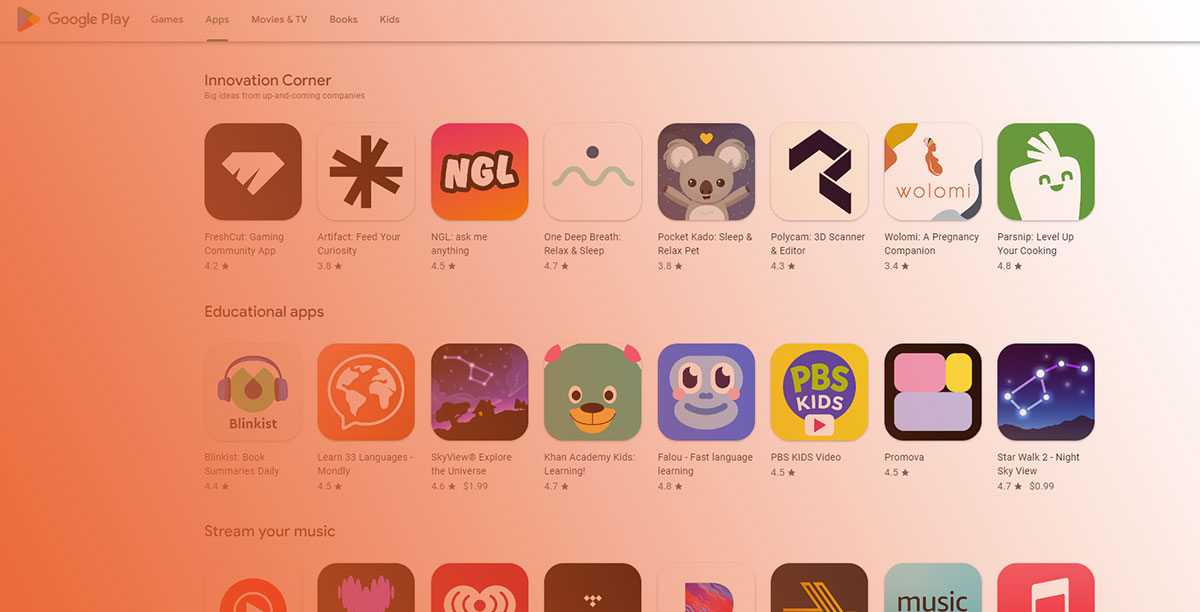
Phone screenshots account for the majority of store listing views. Most users browse the Play Store on their phones, and these are the only screenshots that are strictly mandatory for every app.
Recommended resolution: 1080 x 1920 pixels (portrait, 9:16 aspect ratio). This is the safe universal choice that renders cleanly on virtually every Android phone.
You can also go taller. Resolutions like 1080 x 2160 or 1080 x 2340 work well for apps with longer scrollable interfaces. Just keep that 2:1 ratio limit in mind. A 1080 x 2200 screenshot would get rejected because 2200 exceeds twice 1080.
According to ASO Mobile research from 2025, about 90% of users never scroll past the third screenshot. That means the first two or three images carry almost all the decision-making weight. Put your strongest screens up front.
Portrait vs. Landscape on Phone Listings
Portrait (9:16) is the default for most apps. It matches how people hold their phones, and the Play Store layout gives portrait screenshots more visual space in the gallery scroll.
Landscape (16:9) makes sense for games or media apps where the experience is naturally horizontal. Google accepts both orientations, but mixing them in the same listing looks inconsistent. Pick one and stick with it.
Google Play shows phone screenshots in a horizontal carousel on the app listing page. On some devices, the first screenshot is partially visible even before the user taps into the full gallery. That first image is doing heavy lifting for your conversion rate.
Common Phone Screenshot Mistakes
- Exceeding the 2:1 ratio with ultra-tall screenshots that get silently rejected during upload
- Using PNG files with alpha transparency (Play Console will block them)
- Submitting blurry or stretched images below 1080p when the app targets modern devices
- Front-loading screenshots with branding instead of actual app UI
Google’s content policy now prohibits text in screenshots that includes ranking claims like “Best” or “#1,” as well as calls to action like “Download Now.” Submissions with these get flagged during review.
Tablet Screenshot Dimensions

Tablet screenshots are only required if your app targets both phones and tablets. But if you skip them, you lose visibility to tablet users entirely. And Google has been pushing large-screen support hard since 2023.
Play Console separates tablet uploads into two categories: 7-inch tablets and 10-inch tablets. You can upload up to 8 screenshots for each.
7-Inch Tablet Screenshots
The recommended resolution here is 1200 x 1920 pixels in portrait or the inverse for landscape. These match common 7-inch Android tablet displays and render cleanly across the category.
Google requires a minimum of 4 screenshots for tablets and Chromebooks if your app targets them. The aspect ratio should follow the same 16:9 (landscape) or 9:16 (portrait) guidelines, though some 16:10 ratios are accepted.
One shortcut that works (but isn’t ideal): you can upload the same screenshots to both the 7-inch and 10-inch slots in Play Console. Google allows this. It saves time during app deployment, but users on larger tablets may notice the layout doesn’t look quite right.
10-Inch Tablet Screenshots
Target resolution: 1600 x 2560 pixels or 2048 x 2732 pixels for high-density 10-inch displays.
The bigger screen means more visible UI detail, which actually raises the bar. Small text, low-contrast elements, and cramped layouts become more obvious at tablet scale. If your app has a responsive layout, capture the screenshots directly from a 10-inch emulator in Android Studio rather than just stretching phone screenshots.
According to AppTweak data from H1 2024, the average conversion rate on US Google Play was 27.3%. Missing tablet screenshots doesn’t just mean fewer tablet installs. It can signal to Google’s ranking systems that your app isn’t optimized for large screens, which may affect broader visibility.
Chromebook and Large Screen Screenshot Sizes
Google has been quietly raising the bar for large-screen app quality. Chromebook screenshots now fall under the same upload section as tablets in Play Console, and they share the same minimum requirement of 4 screenshots.
The resolution range accepted is 1080 to 7680 pixels, with a 16:9 (landscape) or 9:16 (portrait) aspect ratio. Most Chromebook users run apps in landscape mode, so that’s the orientation to prioritize.
Here’s what’s changed in practice. Google’s large-screen app quality guidelines increasingly tie screenshot compliance to promotional eligibility. Apps without proper Chromebook or tablet screenshots are less likely to appear in curated Play Store collections for large-screen devices.
Foldable Device Screenshots
Foldable phones like the Samsung Galaxy Z Fold series create a tricky middle ground. They’re bigger than a phone but smaller than a tablet, and the user can switch between folded and unfolded modes.
As of 2025, Google doesn’t have a dedicated foldable screenshot slot in Play Console. Foldable screenshots typically go under the tablet category. The safest approach is to capture your app’s unfolded view at 1812 x 2176 pixels (or similar) and upload it alongside your standard tablet screenshots.
If your team is building with Android development frameworks that support adaptive layouts, capturing foldable-specific screenshots becomes much easier. The Android SDK tools include emulator configurations for popular foldable devices.
Why Chromebook Screenshots Are Worth the Effort
Chromebook app usage keeps growing, especially in education and enterprise. Skipping these screenshots means your app is invisible to that entire user base when they browse the Play Store on their Chromebook.
The effort is minimal if you’re already generating tablet screenshots. Use the same design templates, adjust the device frame to a laptop mockup, and capture at landscape 1920 x 1080 or higher. Most mobile app development tools now support Chromebook emulator profiles for exactly this purpose.
Wear OS, Android TV, and Android Auto Screenshot Specs
These form factors have their own rules. And the specs look nothing like phone or tablet requirements.
Wear OS Screenshots
Required spec: At least 1 screenshot at 384 x 384 pixels with a perfect 1:1 aspect ratio.
That’s it for the minimum. But there’s more to it than just size.
Google prohibits framing Wear OS screenshots inside a watch device image. No promotional text, no background graphics, no transparent layers. The screenshot must show the actual in-app UI and nothing else. This is stricter than phone or tablet rules.
ScreenshotWhale research from 2026 notes that roughly 16% of smartphone users now own a smartwatch. Nearly 70% of professional ASO teams create device-specific screenshot variants rather than using a single set across all form factors.
Design for a circular viewport even though the canvas is square. Most Wear OS devices display content in a circle, which means the corners of your 384 x 384 image get clipped. Keep critical UI elements inside a centered safe zone.
Android TV Screenshots
Minimum resolution: 1920 x 1080 pixels at a 16:9 landscape aspect ratio.
At least 1 screenshot is mandatory for apps distributed on Android TV. You also need a separate TV banner image at 1,280 x 720 pixels (JPEG or 24-bit PNG, no alpha). The banner acts like the app icon on the TV home screen.
| Device Type | Min Resolution | Aspect Ratio | Min Count | Max Count |
|---|---|---|---|---|
| Phone | 1080 x 1920 px | 9:16 or 16:9 | 2 | 8 |
| 7-inch Tablet | 1200 x 1920 px | 9:16 or 16:9 | 4 | 8 |
| 10-inch Tablet | 1600 x 2560 px | 9:16 or 16:9 | 4 | 8 |
| Chromebook | 1080 px+ (landscape) | 16:9 or 9:16 | 4 | 8 |
| Wear OS | 384 x 384 px | 1:1 | 1 | 8 |
| Android TV | 1920 x 1080 px | 16:9 | 1 | 8 |
TV screenshots are only shown to users browsing the Play Store on Android TV devices. So these images need to work at “10-foot UI” distance. Big, bold visuals. Readable text. No tiny fonts or dense layouts.
Android Auto
Android Automotive OS has its own screenshot section in Play Console. Requirements vary depending on whether your app falls into a “parked” category or not. For non-parked apps, you need at least 2 portrait (800 x 1,280 px) and 2 landscape (1,024 x 768 px) screenshots.
This is a newer requirement and catches many developers off guard. If your app supports Android Auto, check the Play Console documentation before submission to avoid last-minute rejections during the software release cycle.
How to Create Screenshots That Meet Google Play Requirements
Knowing the pixel specs is one thing. Actually producing compliant, good-looking screenshots across every device type is the part where teams burn time.
Capturing Screenshots in Android Studio
Android Studio’s built-in emulator is the most reliable way to get pixel-perfect captures. You pick the exact device profile (Pixel 7 Pro, Nexus 10, Wear OS round, etc.), run your app, and use the “Screen Capture” tool in Logcat.
The emulator handles all the density and resolution math for you. A Pixel 7 Pro profile outputs at 1080 x 2400. A 10-inch tablet profile gives you the right layout proportions without guesswork.
For teams working with cross-platform app development frameworks like Flutter or React Native, the emulator approach still works. Just build your app, deploy it to the virtual device, and capture from there.
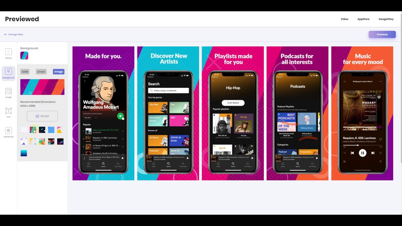
Screenshot Design and Framing Tools
Figma is the go-to for most teams. Free templates exist for every Google Play device frame, and you can batch-produce localized versions quickly. Canva works too, though it’s less precise for pixel-specific layouts.
Dedicated tools like AppScreens, AppLaunchpad, and Screenshots.pro automate device framing and export at the correct dimensions. They’re worth considering if you’re managing screenshots across multiple apps or languages.
The UI/UX design process for screenshots deserves its own attention. Your screenshot gallery is basically a landing page. Each image should answer one question: “What does this app do for me?”
Batch Resizing and Export
If your app targets phones, tablets, and Chromebooks, you’re producing at minimum 3 sets of screenshots, each at different resolutions.
Use export presets in Figma or Sketch to output all sizes from a single master design. Most teams create the phone version first (1080 x 1920), then scale up for tablet (1600 x 2560) and adapt the layout for landscape Chromebook (1920 x 1080).
File format tip: export as PNG for UI-heavy screenshots with text. Use JPEG at 90-95% quality for screenshots that are photo-heavy or contain complex gradients. Both are accepted, but PNG gives you sharper text rendering. Either way, keep each file under that 8 MB limit.
Running a quick validation pass in Play Console’s preview mode before hitting submit saves a lot of back-and-forth. Upload your files, check the preview on each device section, and confirm nothing is cropped or scaled awkwardly. Then you’re good to go.
Google Play Screenshot Upload Limits and Rules

Play Console has hard limits on what you can upload, how many, and what’s allowed inside the image itself. Violating any of them blocks your submission or, worse, gets your listing flagged after it’s live.
Upload Counts Per Device Type
Phones: minimum 2, maximum 8 screenshots.
Tablets and Chromebooks: minimum 4 each (if your app targets them), maximum 8.
Wear OS: minimum 1, maximum 8. Android TV: minimum 1, maximum 8. Android XR: 4 to 8 screenshots at an 8:5 aspect ratio (minimum 1920 x 1200 pixels), per Google Play Console documentation.
You must provide at least 2 screenshots across different device types total to publish your store listing. Most apps go with 5 to 8 per device type, according to RPLG research from 2024.
Content Policy Restrictions
Google’s metadata policy goes beyond pixel specs. It dictates what’s allowed inside your screenshots.
- No ranking claims (“Best,” “#1,” “Top,” “Award-winning”)
- No calls to action (“Download now,” “Install,” “Try free”)
- No price or promotional language (“Sale,” “Discount,” “50% off”)
- No third-party trademarks or unauthorized branding
- No misleading visuals showing features the app doesn’t actually have
The App Launchpad reports that promotional claims are one of the most common reasons for screenshot rejection during Google Play review. Took me a while to figure this out on a real project. Your marketing team designs a screenshot with a “Try it Free” badge, uploads it, and the whole release stalls.
Localized Screenshot Requirements
Google Play supports custom store listings by language and country. Each localized listing can have its own screenshot set, which needs to meet the same technical requirements as your default listing.
The text in localized screenshots must match the language of the listing. You can manage these under Store presence > Custom store listings in Play Console. If your app targets multiple markets, plan for separate screenshot production per language, not just translated overlays on the same images.
According to AppTweak data, localized store listings with region-specific screenshots see measurably better conversion rates than listings using a single English screenshot set globally. The effort pays off, especially in markets like Japan, Germany, and Brazil where users expect native-language app previews.
How Screenshots Display Across the Google Play Store

Your screenshots don’t show up the same way everywhere. Google uses them across multiple surfaces, and how they’re cropped, scaled, and ordered depends on context.
Search Results vs. Listing Page
Here’s the thing most developers miss. On Google Play, screenshots appear in search results only for brand name searches, according to Sommo research from 2024. If someone searches your exact app name, they’ll see the listing page with screenshots and an install button.
For generic keyword searches (like “photo editor” or “budget tracker”), the Play Store shows a list of apps with just the icon, title, and rating. No screenshots visible. This is the opposite of Apple’s App Store, where the first three screenshots show directly in search results for all queries.
That distinction matters for your screenshot strategy. On Google Play, screenshots do their conversion work on the listing page itself, not in search. So your first screenshot needs to hook users who have already tapped through, not catch their eye while scrolling through search results.
Cropping and Scaling Behavior
| Surface | What Users See | Design Implication |
|---|---|---|
| App listing page | Full screenshot gallery (horizontal scroll) | First 2–3 images carry most weight |
| Play Store homepage | Feature graphic + first screenshot (may be cropped) | Keep key elements centered |
| Brand search results | Listing with screenshots visible | First screenshot visible at small size |
| Large-screen Play Store | Expanded screenshot gallery with form-factor filtering | Submit device-specific screenshots |
Google auto-selects which screenshot set to display based on the user’s device. A tablet user sees tablet screenshots if you uploaded them. If you didn’t, they see phone screenshots scaled up, which usually looks rough.
First Screenshot Impact on Conversion
ASO Mobile 2025 research found that roughly 90% of users don’t scroll past the third screenshot. That gives you about 7 seconds to make an impression, according to the same source.
Google Tasks does this well. Clean device mockup, bold headline (“Get more done”), and a clear UI preview. No clutter. The value is obvious in one glance.
When a preview video is included on the listing page, it appears before the screenshots. Portrait screenshots display smaller next to a landscape video, so factor orientation consistency into your asset planning. Your entire software development process should account for screenshot production as a release task, not an afterthought.
Screenshot Size Changes in Recent Google Play Console Updates
Google doesn’t always announce screenshot requirement changes loudly. Some updates arrive as quiet backend changes that developers discover through failed uploads or rejected submissions.
Android XR and New Form Factors
Android XR headsets are the newest addition to Play Console’s screenshot slots. The requirement: 4 to 8 screenshots at an 8:5 aspect ratio, with a recommended resolution of 3840 x 2400 pixels (minimum 1920 x 1200). This was added alongside Google’s push into spatial computing.
Android Automotive OS also has its own distinct section now. Non-parked apps need at least 2 portrait (800 x 1,280 px) and 2 landscape (1,024 x 768 px) screenshots.
These additions mean the total number of supported device types in Play Console has grown to seven: phones, 7-inch tablets, 10-inch tablets, Chromebooks, Android TV, Wear OS, Android Automotive OS, and Android XR headsets.
Tablet and Chromebook Guidelines Refresh
At Google I/O 2024, Google announced that Play Store listings now display screenshots, ratings, and reviews specific to each form factor. Tablet users see tablet-specific data. Chromebook users see Chromebook assets.
This was a meaningful shift. Previously, tablet users might see phone screenshots with generic scaling. Now the Play Store actively differentiates, which means skipping tablet or Chromebook screenshots has a real cost in user trust and conversion.
The Android Developers Blog confirmed that apps with assets following the large-screen content quality guidelines get access to richer display formats on Play homepages. Your Google Play A/B testing strategy should include testing tablet-specific screenshots separately from phone variants.
How to Audit Existing Listings
- Open Play Console and navigate to Store presence > Main store listing
- Check each device section for missing or outdated uploads
- Verify aspect ratios and file sizes match current specs
- Confirm screenshots reflect the current app version
The App Screenshot Maker blog (verified as of March 2026) notes that Google Play Console has historically changed image requirements without much fanfare. Running a quarterly audit of your screenshot assets is the safest way to avoid surprise rejections during a software test plan or release cycle.
Google Play Screenshot Sizes Reference Table

This is the full consolidated spec sheet. Bookmark it, print it, share it with your design team. Every dimension, ratio, and file rule for every device type Google Play currently supports, all in one place.
| Device Type | Min Resolution | Max Resolution | Aspect Ratio | Min/Max Count |
|---|---|---|---|---|
| Phone | 1080 x 1920 px | 3840 px max side | 9:16 or 16:9 | 2 / 8 |
| 7-inch Tablet | 1200 x 1920 px | 7680 px max side | 9:16 or 16:9 | 4 / 8 |
| 10-inch Tablet | 1600 x 2560 px | 7680 px max side | 9:16 or 16:9 | 4 / 8 |
| Chromebook | 1080 px+ (landscape) | 7680 px max side | 16:9 or 9:16 | 4 / 8 |
| Wear OS | 384 x 384 px | 3840 px max side | 1:1 | 1 / 8 |
| Android TV | 1920 x 1080 px | 3840 px max side | 16:9 | 1 / 8 |
| Android Automotive | 800 x 1280 / 1024 x 768 | 3840 px max side | Portrait + Landscape | 2+2 / 8 |
| Android XR | 1920 x 1200 px | 3840 x 2400 px | 8:5 | 4 / 8 |
Universal rules across all device types:
- File format: JPEG or 24-bit PNG (no alpha transparency)
- Max file size: 8 MB per image
- Max dimension can’t exceed twice the min dimension (2:1 ratio cap)
- Color space: sRGB (CMYK files get rejected)
Google Play vs. Apple App Store Quick Comparison
Developers building for both platforms often ask how the specs stack up side by side. Here’s the short version.
| Spec | Google Play | Apple App Store |
|---|---|---|
| Resolution approach | Flexible range (320–3840 px) | Fixed per device model |
| Max screenshots per type | 8 | 10 |
| Screenshots in search | Brand searches only | First 3 visible in all searches |
| Submission model | Upload once, Google scales | Upload per device size (simplified in 2024) |
| A/B testing | Built-in (Store Listing Experiments) | Product Page Optimization (PPO) |
Apple tightened its submission process in late 2024, allowing developers to upload screenshots for just one iPhone size and one iPad size, with automatic downscaling to smaller models. Google has always worked this way, which gives Android developers one less thing to worry about.
If your team builds for both platforms using Flutter or React Native, you’ll still need separate screenshot sets. The layouts, dimensions, and store display rules are different enough that one set of images can’t serve both stores without looking out of place. Factor screenshot production into your mobile app development timeline early, not during the final week before launch.
Adapty’s 2026 benchmark roundup cites an average US Google Play conversion rate of 27.3% (based on AppTweak H1 2024 data). Apps with 6 to 8 screenshots per device type show roughly 35% higher engagement than those using only the minimum, according to Medium’s App Screenshot Studio analysis from January 2026.
Your screenshots are the visual pitch. Get the sizes right, the content clear, and the device coverage complete. The rest is testing.
FAQ on Google Play Store Screenshot Sizes
What is the minimum screenshot size for Google Play?
Every screenshot must be at least 320 pixels on its shortest side. The maximum is 3,840 pixels. The longest side can’t exceed twice the shortest, capping you at a 2:1 aspect ratio.
What file formats does Google Play accept for screenshots?
Google Play accepts JPEG or 24-bit PNG files only. No alpha transparency allowed on PNGs. Each file must stay under 8 MB and use the sRGB color space. CMYK files get rejected.
How many screenshots can I upload per device type?
Phones require a minimum of 2 and allow up to 8. Tablets and Chromebooks need at least 4. Wear OS and Android TV each require a minimum of 1. All device types cap at 8 screenshots.
What is the recommended phone screenshot resolution?
The standard is 1080 x 1920 pixels in portrait (9:16 ratio). This works cleanly across virtually all Android phones. Taller options like 1080 x 2340 are accepted but must stay within the 2:1 ratio limit.
Do I need separate screenshots for tablets?
Only if your app targets tablets. But skipping them means tablet users see scaled-up phone screenshots, which looks rough. Google recommends 1600 x 2560 pixels for 10-inch tablets and proper tablet UI layouts.
What are the Wear OS screenshot requirements?
Submit at least 1 screenshot at 384 x 384 pixels with a 1:1 aspect ratio. No device frames, no promotional text, no transparent backgrounds. The image must show actual in-app UI only.
What causes Google Play to reject screenshots?
Common reasons include wrong aspect ratios, alpha transparency in PNGs, resolution below minimums, and misleading content. Promotional text like “Best App” or “Download Now” also triggers rejection during review.
Do screenshots appear in Google Play search results?
Only for brand name searches. Generic keyword searches show just the icon, title, and rating. Screenshots do their conversion work on the listing page itself, not while users scroll through search results.
Can I A/B test screenshots on Google Play?
Yes. Google Play Console offers Store Listing Experiments for free. You can test up to 3 screenshot variants against your current listing and measure which version drives more installs and retained users.
What screenshot specs does Android XR require?
Android XR headsets need 4 to 8 screenshots at an 8:5 aspect ratio. The recommended resolution is 3840 x 2400 pixels, with a minimum of 1920 x 1200. Files must be PNG or JPEG under 8 MB.
Conclusion
Getting your Google Play Store screenshot sizes right is a baseline requirement, not a bonus. Every device type in Play Console has its own resolution, aspect ratio, and upload count, and ignoring any of them costs you visibility.
Phone screenshots at 1080 x 1920, tablet assets at 1600 x 2560, Wear OS squares at 384 x 384, and Android TV landscapes at 1920 x 1080. Each one serves a different user on a different screen.
Use Store Listing Experiments to test which screenshot sets actually convert. Keep your JPEG and PNG files under 8 MB, in sRGB, with no alpha transparency.
Audit your listings quarterly. Google updates Play Console requirements without much warning, and new form factors like Android XR keep expanding the spec sheet. Stay current, match the specs, and let your app’s UI do the selling.
Many of his resources are available on various design marketplaces and for free on Codepen.
Over the years, he's worked with a range of clients and contributed to design publications like Design Your Way, Designmodo, WebDesignerDepot, WPDean, Speckyboy, and Slider Revolution among others.
- How to Set Up Subscriptions on Google Play (Developer Guide) - July 12, 2026
- Why Work With a CMS Development Company for a Secure and Scalable Website? - July 12, 2026
- ADB Commands Cheat Sheet - July 11, 2026