


Picture this: You’ve crafted an app, poured your heart into coding each feature, and navigated the maze of development. Officially launching it is your next leap. Your gateway? The android app store icon, a beacon signaling users to dive into your digital creation.
Here’s the scoop—this tiny, potent emblem embodies more than just a graphic. It’s your first handshake with potential users, the make-or-break moment in a crowded digital bazaar.
Fret not, for today you’ll unravel the icon’s secrets. By the close, expect to hold the know-how on designing an icon that not only stands out but speaks volumes of your app’s soul.
We’ll walk through the essence of an icon design that aligns with the nuanced Material Design guidelines, the technicalities of delivering a high-resolution app download icon, and why adaptive app icons are changing the game.
Ready to make your mark in the mobile app universe? Let’s dive into the nitty-gritty of perfecting that Android marketplace emblem.
Understanding Google Play Store Icon Requirements
Navigating the digital playground, the Android app store icon serves as the face of your app in Google’s bustling marketplace.
Think of it as the storefront window, your app winking at potential users, beckoning them for a closer look.
Technical Specifications
Google Play Store Icon Size
Aim for sharp, crisp icons that play well on varied screen sizes. We’re talking 512px by 512px of pixel-perfect real estate that ensures your app icon looks fabulous on both small hand-held screens and the larger displays.
It’s the sweet spot, where each pixel pitches in to paint a picture that says, “Hey, tap me!”
Format and Color Space: Ensuring Technical Compatibility
Next, let’s chat about format and color space. PNG is the go-to here; it’s like the universal handshake in image formats for app icons.
RGB color space? Non-negotiable. It’s like the oxygen giving life to the colors in your icon, making them stand out in the lineup. Stick to these, and you’re golden.
File Size Limitations: Balancing Quality and Requirements
The file size is no small talk either. You’ve got to juggle high quality with Google Play’s file size cap of 1024KB.
Overpack your pixels, and you might end up with a digital heavyweight, slow to download, and quick to frustrate.
Design Constraints
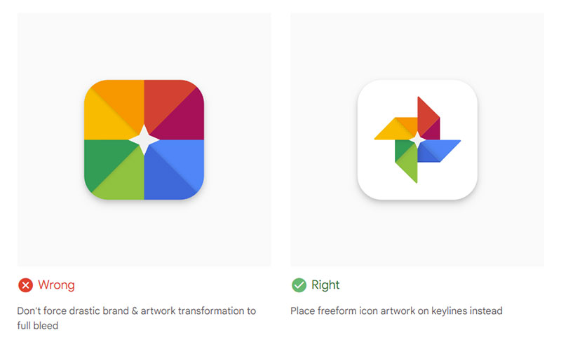
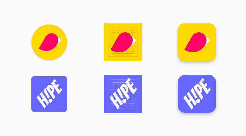
Shape Considerations: Navigating Google Play’s Dynamic Handling
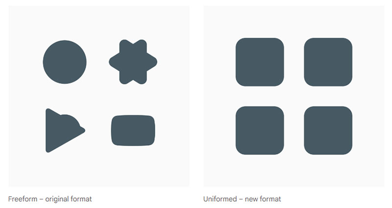
Shape up or ship out – Google Play Store’s dynamic handling of icons means business.
Ultimately, the adaptive icon support gives users a more unified visual experience. Squircle, square, or circle? Make sure your art fits comfortably in all shapes, like a chameleon adapting to its space.
Shadow and Corner Treatments: Google Play’s Automatic Adjustments
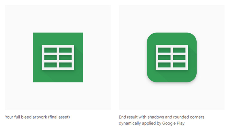
Lastly, the visual flairs—shadows and corners. Google Play adds them automatically to keep things consistent across the board.
But hey, that doesn’t mean you toss in extra shadows or round those corners yourself. Let Google do its thing and focus on creating a standout central element that’s all about your app’s vibe.
Keep your icon clear of those edges, like it’s floating in its own little bubble.
Strategic Design Principles for App Icons
In the sea of apps, each Android app store icon is a lighthouse guiding users to land on their digital shore. It’s about making that siren call sing the right tune.
So, let’s break down the artistry behind icon crafting, where every pixel is a note in your app’s melody.
Simplicity and Clarity
The Power of Minimalism: Why Less Is More
Imagine this: you’ve got this tiny canvas, and you need to tell a whole story. This is where minimalism rocks the stage.
It’s like a zen garden for icons, where less clutter means more breathing room for your design to truly shine. Think bold. Think basic shapes and limited colors. It’s about making that one glance say everything, loud and clear.
Achieving Icon Recognition: Tips for Instantly Identifiable Designs
Bingo! That’s what you want them to say when they spot your Android app store icon. Recognition – it’s the name of the game.
How to snag it? Use familiar symbols, but with a twist that’s all you. A dash of contrast here, a pop of color there. It’s about making that visual statement: “Hey, remember me?”
Uniqueness and Memorability
Standing Out in a Crowded Market
So you want to be the one breaking necks as users scroll past a hundred icons? It’s all about getting that unique tattoo that makes your Android app store icon unmistakable.
A swirl, a slash, maybe even a quirky mascot. Make it unexpected, make it bold. Users should be able to spy your icon from the corner of their eye and go, “Yep, that’s the one!”
Strategies for Differentiating Your Icon from Competitors
Easier said than done, though. But here’s a trick – peek at your neighbors. What’s their vibe? Now, flip it. If they’re all blues and greens, throw in some fiery reds.
If they’re sporting vintage, slide into that futuristic sleek. It’s about finding your beat in the app icon orchestra.
Consistency with Brand and App Functionality
Aligning Icon Design with Brand Identity
Your app’s icon isn’t just a pretty face; it’s your brand ambassador. It should wear your brand like a snug suit – tailored to perfection.
Every curve and shade should whisper your brand’s DNA, leaving that taste of “you” when users see it.
Reflecting the App’s Core Purpose and Function
Lastly, what’s your app all about? Is it music? Maybe some killer tunes in the icon. A fitness app? Flex those muscles in your design.
The Google Play app store icon should be more than an eye-catcher; it should be a storyteller, giving users a sneak peek into the journey they’re about to embark on with your app.
Color and Aesthetics in Icon Design
When it comes to dressing up that Android app store icon, colors are the threads we weave our visual stories with.
It’s a silent convo between the icon and potential app lovers, where each shade echoes a vibe, a mood, a promise.
Psychological Impact of Colors
Color Theory: Understanding User Perception
Splash on the canvas of the mind — that’s what colors do. They’ve got the power to make folks feel all sorts of things.
Like, blue doesn’t just say ‘sky’; it whispers trust, calm, and maybe a bit of ‘I’m a pro.’ Get what I mean? It’s like each color has its own secret language, and understanding that? That’s the real game.
Choosing the Right Color Scheme: Tips and Best Practices
So, picking your Android app store icon‘s outfit, that’s kinda a big deal. Here’s a tip: keep it tight, like three colors tops. And harmony, my friend, is your buddy.
You want them shades holding hands, not wrestling for the spotlight. Think soft and complementing, or go bold with contrasts that snap. Keep the user in mind; you want colors that stick like a catchy tune, unforgettable.
Visual Elements and Symbolism
Using Symbols and Imagery: Balancing Abstraction and Representation
Pictures paint a thousand words, right? The symbols you swizzle into that icon, they’re like little clues. A magnifying glass? Smacks of search or discovery.
Heart? I’d swipe right to love or health. But here’s the clincher: don’t overcrowd it. Balance is key. Like, throw in abstraction but also keep it real enough so folks can catch the drift at a mere glimpse.
Scalability: Ensuring Legibility Across Devices
Last on the docket, but dude, super key: scalability. Your Android app store icon needs to be like a chameleon, slick and legible, no matter if it’s on a smartwatch or a billboard.
Every element, from the lines to the shapes, should be clear as day across the board. ‘Cause what’s the point if it looks ace on a tablet but turns into mush on a phone, right?
The Design Process and Best Practices
Crafting that kickass Android app store icon isn’t just about slapping together some cool graphics.
It’s a journey, a sort of creative wandering that takes you from a ‘what if’ to a ‘wow’ moment.
Initial Concept and Sketching
Brainstorming and Ideation Techniques
First off, let’s spill the beans on brainstorming. Tap into everything – the essence of the app, the zing of the brand, the dreams of users. Mull it over, then throw ideas around like confetti. This is where the seed for that Android app store icon gets planted.
Sketching and Preliminary Designs: Laying the Foundation
Now grab that pencil. Time to sketch those daydreams into lines and curves. No worries if it’s rough – these first doodles are the blueprint, the clay to be molded. It’s the staging ground for what’s about to morph into your app’s flag.
Prototyping and Refinement
Digital Mockups: From Concept to Prototype
Alright, sketches are done. It’s digital makeover time. Translate those rough gems into slick mockups.
Software tools enter stage left, making those lines clean, colors pop, and the icon starts to breathe life.
Refining Designs: Iterative Process for Perfection
But, hold up. One shot rarely hits the target. It’s a game of tweak, twist, nudge, and maybe even a complete makeover.
It’s about loving the delete key, embracing the undo, and doing it all over again.
You’ll know when you hit jackpot – it clicks, and boom, the Android app store icon is no less than iconic.
User Testing and Feedback
Importance of A/B Testing: Finding What Works
Here’s where the rubber meets the road. A/B testing – it’s like having a bake-off between your best icon contenders.
Serve ’em up to a bunch of users, see which one makes them click, tap, and download.
Collecting and Incorporating User Feedback
And then – listen. Really listen. The good, the bad, the ‘meh.’ This is gold, my friend.
User feedback is the compass that points you to that Android app store icon that doesn’t just float in the digital sea, but sails.
Adhering to Platform-Specific Guidelines
Walking the path of app icon creation is like dancing to the rhythm of an ever-changing melody.
It’s about syncing steps with the moves of the platform you’re aiming to dazzle. And when it’s the Android app store icon—the dance gets even more intricate.
Navigating Google Play’s Design Ecosystem
Understanding Google Play’s Unique Environment
Google Play is like this vast ocean, teeming with diverse digital life.
Each app, a unique creature, and your Android app store icon, that’s the beacon, the lighthouse guiding users to your island. Getting this right means deeply diving into the waters of Google Play’s design ethos, which zigs where others might zag.
Tips for Aligning with Google Play’s User Expectations
Users come to Google Play with a map of expectations. They look for icons that speak Android, that hum a tune they’re familiar with.
Bright, clean, and upfront. Icons that feel at home on their device, like that favorite comfy t-shirt that somehow goes with everything.
Cross-Platform Consistency
Maintaining Brand Consistency Across Different Platforms
Imagine your Android app store icon as your app’s face across various parties.
Now, that face needs to keep its charm, whether it’s mingling at Google Play or hobnobbing over at Apple’s App Store. Keep those key features – colors, symbols, that X-factor – consistent, so users recognize your star app across the board.
Adapting Icons for Multiple Platforms: Strategies and Considerations
But here’s the kicker. Each platform’s got its own rules, its own fashion.
What looks dapper in Google’s land might need a tuck and trim for Apple’s. Adapting your icon means dressing it for the occasion while never losing out on what makes it, well, it. It’s about that subtle play of change and constancy.
Optimizing Icons for ASO (App Store Optimization)
Diving into the ASO ocean, we’re scouting for that sweet spot where the Android app store icon not only looks snazzy but also reels in the crowd, hook, line, and sinker.
Keywords and Visual Elements
Integrating Keywords into Visual Design
Words have this ninja way of boosting visibility. Imagine blending them into your app’s icon design, like embedding secret messages that shout out what your app’s all about.
But here’s the twist – it’s not about actual text on your icon, nah. It’s about using visual cues that echo those keywords users are hunting for.
Balancing Text and Imagery for Clarity
It’s like walking a tightrope, really. Too much text, and your Android app store icon starts to look like a jumbled crossword puzzle.
Nobody’s got time for that. Lean into imagery that speaks those same words, without uttering a single syllable. It’s symbolism at its best – swift, silent, and super effective.
Impact of Icon Changes on ASO Performance
Monitoring Performance Metrics Post-Update
Now, say you switch up your icon – a nip here, a tuck there. Keep your peepers on the ASO metrics, will ya? It’s like watching the weather vane after you’ve sown your crops.
Which way’s the user engagement blowing? Downloads heading north? That’s the stuff.
Case Studies: Successful Icon Updates and Their Impact
Nothing like a good success story to toast to, right? Case studies of icons that went from blah to brilliant — they’re the treasure maps for your ASO journey.
These yarns tell tales of tweaks that took Android app store icons from the shadows to the spotlight. No magic, just smarts and paying attention to what worked – that’s the real MVP.
FAQ On The Android App Store Icon
What is the Size Requirement for Android App Store Icons?
The Google Play Store demands a 512×512 pixel squash for your icon.
Spot on for visibility across devices. It’s about making sure your Android app store icon shines like a well-polished gem. A pixel cliff dive? Nada. Keep it within the lines.
How Can I Make My Icon Stand Out in the Android App Store?
Crucial stuff, this. To elevate your Android app store icon to celebrity status, channel uniqueness and a splash of creativity. Vibrant colors, a distinctive design that echoes your brand’s spirit – cook that up with simplicity, and you’ve got yourself a win.
What Color Palette Should I Use for My Android App Store Icon?
Go bold or serene – whatever strums the right chords with your app’s persona. Use color theory, pick hues that gel with user emotion, and for goodness sake, let harmony lead the charge. A tight-knit color trio max is your golden ticket.
What are the Technical Requirements for Android App Icons?
The Google Play Store sings in PNG format, dancing in the RGB color space. A file size just shy of a megabyte – 1024KB – keeps things breezy for downloads. That’s the tech tango for your icon.
Does Material Design Matter for Android App Store Icons?
Absolutely! It’s like the rulebook for the visual feast. Material Design guidelines ensure your Android app store icon fits snug in the Android OS aesthetic. It’s about playing nice with the system’s vibe.
Can I Use Text in My Android App Store Icon?
Easy does it with text in icons. A word here or there if it’s a must, but don’t forget – pictures pack the punch. Strive for visuals that don’t need a dictionary, a design that mouths your message without whispering a word.
How Often Should I Update My Android App Store Icon?
Don’t be that stale chip in the bag. Keep your Android app store icon fresh, align it with updates, seasonal vibes, or just when it feels tired. Measure performance, though, and let that guide the refresh timeline.
Are There Any Specific Brand Guidelines for Android App Icons?
Nail those brand guidelines down like you’re bracing for a storm. Color, shape, that unique twinkle – let your android app store icon wear your brand with pride, but don’t shy away from the Google Play Store’s own couture either.
What’s the Impact of My Icon on ASO?
A whopper, that’s what. Your Android app store icon can crank up your ASO mileage big time. It’s front-row and center, a heavyweight in the first impressions arena, so sculpt it to charm at first sight.
How Do I Optimize My Icon for Different Devices?
Shape-shifter tactics! Craft your Android app store icon to snuggle comfortably across devices, maintain legibility whether it’s thumb-sized or billboard-big. Adaptability in your design keeps the experience seamless, mate.
Conclusion
Wrapping this up, let’s not forget that creating an Android app store icon is more than art—it’s a handshake with potential users. Every choice, from the splash of color to the shape that captures the app’s essence, tells a story. Remember, it’s a pixel puzzle where every piece matters.
- Think minimalism for clarity.
- Innovate within the Material Design framework to jive with the Android vibe.
- Dance to the tune of technical specs while weaving in brand consistency.
- Consider ASO strategies, as an icon could skyrocket visibility and downloads.
In the tapestry of the digital marketplace, your Google Play store icon is a key thread. It’s the silent ambassador of your app, whispering tales of innovation, functionality, and creativity to every passerby in Google’s bustling bazaar. Let’s craft icons that aren’t just seen—they’re remembered.
With over a decade in the tech field, Bogdan blends technical expertise with insights on business innovation in technology.
A regular contributor to TMS Outsource's blog, where you'll find sharp analyses on software development, tech business strategies, and global tech dynamics.
- Benefits of Working with a Professional Web Development Company For Your Website - April 29, 2024
- What’s Odoo ERP And How To Integrate It - April 29, 2024
- Design Collaboratively: UX/UI Apps Like Figma - April 28, 2024