Design Basics: iPhone App Icon Size Requirements

Picture this. You’ve just brewed the boldest cup of morning java, settled at your workspace, and you’re ready to tackle the day—it’s time to craft that killer app. But wait, before users even get a taste of the functionality, there’s that one detail grabbing their eyes first—the icon.
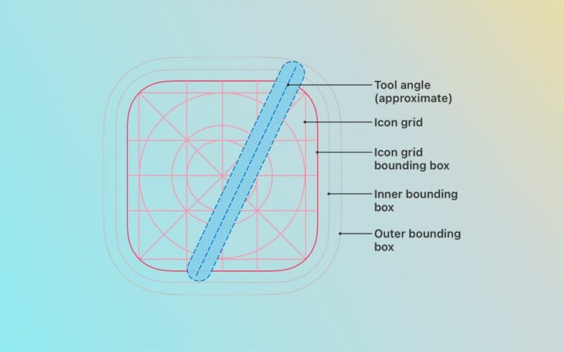
Arguably, it’s the suit-and-tie of your app, the first handshake with your user. As an integral piece of app design best practices, getting the iPhone app icon size spot-on is non-negotiable.
Dive in, and by the article’s end, unlock the secrets to nailing those pixel-perfect app icon dimensions that stand out on the crowded App Store shelves.
In this digital walkthrough, I’ll guide you through the maze of iOS icon guidelines and the nuance of resolution for iOS icons.
Coupled with insights on how these visuals harmonize with user interface customization and branding, you’re set to elevate your app’s identity. Let’s decode the alchemy behind these visual gatekeepers and ensure your app icon is not just seen, but remembered.
iPhone App Icon Size Requirements
| Icon Usage | Pixel Dimensions | Resolution (ppi) | Format | Notes |
|---|---|---|---|---|
| iPhone App | 180 x 180 | 401 ppi | PNG | Used for iPhone with Retina HD display |
| iPhone App | 120 x 120 | 326 ppi | PNG | Standard for older iPhone models |
| Settings/Notification | 87 x 87 | 401 ppi | PNG | Smaller icons for settings and notifications |
| Settings/Notification | 60 x 60 | 326 ppi | PNG | Standard for older iPhone models in settings and notifications |
| Spotlight Search | 120 x 120 | 401 ppi | PNG | Used in search results on newer iPhones |
| Spotlight Search | 80 x 80 | 326 ppi | PNG | Used in search results on older iPhone models |
| App Store | 1024 x 1024 | 72 ppi | JPEG or PNG | Large size for App Store submissions |
Understanding iPhone App Icon Requirements
Diving headfirst into the digital sea, there’s a beacon every app needs to navigate by—the iPhone app icon size.
It’s more than just a splash of pixels; it’s your brand’s storefront, the face that users scroll by quicker than a New York minute. Getting it right? That’s your first handshake with the world.
Official Size Guidelines
Talk about tightropes, eh? Striking that balance between artistic flair and the official size guidelines isn’t just about following rules.
It’s about making sure your icon fits all those different iPhone models—like a glove. Apple’s the ringmaster here, and they’ve laid down the law for standard icon sizes.
Standard icon sizes for different iPhone models
Every model has its own sweet spot. You’ve got screens wide enough to land a plane on and others that are more, well, humble.
Pixels pack together differently, and your icon’s gotta make its mark on all of them. You can think of pixels like the stitches on a baseball—too many or too few, and the game’s off.
Requirements for @2x and @3x resolutions
Ever squint at something, trying to get a better look? That’s where the @2x and @3x resolutions come into the picture.
These aren’t just numbers. It’s the tightrope between crisp and fuzzy. Users have eagle eyes, and they can spot a botched job from a mile away—you want clarity that pops, not a hazy question mark.
Small Icon Sizes for Settings and Notifications
You’re not just playing in the big leagues; there’s a whole minor league game happening in the settings and notifications.
They might be smaller, but they’re just as crucial. You miss the mark here, and it’s like forgetting the lyrics to your own song mid-performance.
Sizes for Spotlight Search and Settings
Imagine your icon chilling in the Spotlight Search and Settings, it’s the cozy coffee shop gig compared to the stadium.
It’s got to fit just right, snug as a bug, making its presence felt without crowding the space. Simplicity is the keynote of all true elegance, even at these sizes.
Sizes for Notification Icons
And let’s talk about those notification icons. They’re those unassuming guests that show up at the party—you didn’t think much about them, but they’re the life of it. Too big, and they’re spilling drinks. Too small, and no one notices them walk in. It’s a bead-sized balancing act.
App Store Icon Specifications
![]()
Finally, we stroll onto the red carpet: App Store submissions.
This is the billboard, the marquee where your app takes a bow.
There’s no understudy here; your icon’s got to be prim and proper, sized to perfection, as per Apple’s guidelines.
Size requirements for App Store submissions
Those App Store icon specifications? They’re non-negotiable. It’s like fitting into that tailored suit for a gala; you leave some wiggle room, but not too much. Adhere to the blueprint, and your icon shines like a star on Hollywood Boulevard.
Importance of adhering to Apple’s guidelines
It boils down to this—adhering to Apple’s guidelines is the golden ticket. Deviating is like trying to fit a square peg in a round hole.
You do it right, and you’re part of the elite crew; you get it wrong, and well, it’s back to the drafting board, with your app icon lost in the wilderness.
Design Principles for iPhone App Icons
![]()
Peel back the layers, and it’s a symphony, every note hitting just right. That’s the magic of a great iPhone app icon size and design.
It’s not just what it looks like, but how it feels in the sea of icons someone scrolls through every day.
Clarity and Recognizability
Picture a billboard as you’re zooming on the highway. What catches your eye? Big, bold, and clear.
Now, shrink that down to a tiny square on your phone—it’s gotta speak volumes without shouting.
The role of simple shapes and symbols
You’d think it’s a piece of cake, but packing purpose into something as small as an icon, that’s art.
Simple shapes and symbols, they’re the secret handshake. They tell a story, no words needed. You see them, and you just know.
Avoiding text and intricate details
You want a glance to do the talking, not a magnifying glass to read tiny text or decode details.
Save the Sherlock Holmes act for mysteries, not your iPhone app icon size.
Consistency with App Design
It’s like your favorite tune, you recognize it from the first note. That’s how your icon should be with your app—a harmonious duet.
Reflecting the app’s overall design theme
Disharmony? It sticks out, and not in the good way. The icon needs to be a slice of the app’s world. If your app was a person, the icon would be its face—make sure it matches the outfit.
Using color schemes that match the app interface
Colors that go together like coffee and mornings. They set the mood. If your app’s wearing pastels, your icon can’t show up in neon—talk about a fashion faux pas.
Utilizing Color and Contrast
Let’s jazz it up but keep it readable. Color and contrast, they’re the dynamic duo of visibility.
Choosing colors that stand out
It’s like picking the perfect outfit for a party—stand out, but stay classy. Colors wave from the screen, calling for attention. Use them like a beacon.
Using contrast to enhance visibility
Lights and shadows, they tango delightfully, giving shapes form and depth. The right contrast, and your icon pops like a firework—too little, it fades into obscurity.
Embracing Minimalism
Ever heard less is more? It’s not just talk. When it comes to icons, minimalism is the ticket to that clean, sharp impression.
The benefits of a minimalist approach
Think of it—every detail earns its keep. No fluff, no clutter. It’s the bare essentials, but it’s also the pure essence. A lighter backpack for a tougher climb—minimalism lets your icon breathe and shine.
Examples of successful minimalist icons
They’re the ones you remember, the ones that stick in your mind long after the screen’s turned off. They’ve stripped down to the basics and nailed it. That’s the benchmark where minimalism wins.
Adhering to Current Design Standards
Navigating the design terrain is like hitting all the right notes on a strumming guitar—when it’s good, it resonates.
When it comes to iPhone app icon size and style, it’s like tapping into a live wire; you’ve got to keep the current flowing.
Apple’s Human Interface Guidelines

Apple has their rulebook, and it’s not just for show. It’s like the secret recipe to their secret sauce. You follow it, and you’re in the tribe.
Key takeaways from the guidelines
Every line is a breadcrumb that leads the way to designing an icon that doesn’t just sit there but actually fits in the palm of your user’s hand, metaphorically. It’s got to meld seamlessly into the ecosystem of sleek, intuitive design that’s Apple’s hallmark.
How to align icon design with Apple’s aesthetic
Alignment—it’s the sweet spot. Your icon should whisper the language of Apple’s sleekness, whispering of subtle contours and a kind of symmetry that’s music to the eyes.
Keeping Up with Design Trends

Design’s an ever-spinning wheel, and staying stationary isn’t an option. Your iPhone app icon size and feel—think of it as the wardrobe that’s gotta keep up with the seasons.
The importance of staying current
Imagine showing up to a modern dance floor grooving to disco—stands out, right? You need your app icon to jive with today’s beat, to be a snapshot of the now.
Risks of outdated icon designs
An out-of-sync icon reads like last year’s news. It’s a dusty shelf in a room full of novelties, and that’s no place for your masterpiece. You need it front and center, in step with the times, making heads turn as they scroll.
Practical Tips for Icon Design and Testing
So, you’re ready to turn that creative storm in your head into an icon masterpiece. Let’s turn the gears and dive into making that iPhone app icon size not just fit, but stand out.
Design Tools and Resources
It all begins with the right gear. Imagine trying to paint the Mona Lisa with crayons. Nope, you need the tools that sing on your wavelength.
Recommended software and templates
The software you choose is like your wand—Adobe XD, Sketch, Illustrator are some front-runners. They’ve got templates baked in, sized up just right to keep your iPhone app icon size looking crisp.
Utilizing mockups and prototypes
Mockups and prototypes, they’re your crystal ball into the future. They let you peek into how your icon will look in the wild, out there on the home screens, long before it takes its first breath.
Testing and Optimization
Once you’ve wrapped that beauty up, how do you know it’s truly ‘the one’? You put it to the test—throw it into the gladiator pit.
A/B testing for icon effectiveness
A/B testing, ever tried choosing between two favorite flicks for movie night? That’s what it’s like, but you get to see which icon makes hearts race and eyes stick. It’s survival of the fittest, but for iPhone app icon size.
Gathering user feedback and analytics
Never underestimate the power of a fresh perspective. Getting feedback and diving into analytics is like reading tea leaves, but more accurate. It tells you if you’ve hit the sweet spot or if you’re shooting in the dark.
Scaling and Formatting
The world’s full of screens of all shapes and sizes. Your icon’s gotta be a chameleon—adaptable but always recognizable.
Preparing icons for different devices and screen densities
It’s like cooking for a crowd—everyone’s got different tastes; you gotta dish out flavors that click for all. Icons should look just as dapper on an iPad as on the iPhone, no compromises.
Best practices for scaling and exporting icons
Now for the final act, exporting. This isn’t just about hitting ‘Save’. It’s about the right formats, resolutions, and ticking all boxes for assets that gel with iOS’s rhythm. It’s making sure your icons are primed for any stage, any spotlight.
Common Pitfalls in App Icon Design
Alright, picture this: You’ve baked this amazing cake, but then you go wild with the icing, and now it’s… a mess. That’s kind of what happens when app icons go south. Let’s shimmy through some slip-ups to avoid when dialing in that iPhone app icon size.
Overcomplication and Clutter
Stuffing every idea into one little square? Nope, that just brews a visual cocktail that no one can swallow.
The drawbacks of overly complex designs
Complicated designs are like tangled headphones; they give you a headache. Simplify, and your icon becomes that catchy chorus everyone hums to without even realizing.
Strategies for simplification
Think of your favorite logo. It’s probably super simple, right? Aim for that. Less can truly be more, giving your icon room to breathe. And that just feels right.
Neglecting Platform-Specific Guidelines
Every platform’s got its beat, its own way of doing the boogie. Missing that can be like wearing flip-flops to a black-tie event—a little awkward.
Consequences of ignoring iOS design standards
Ignore Apple’s design standards, and you risk that cold shrug from the App Store. It’s their ball game; you’ve got to play by the book to even get on the field.
Tips for adhering to platform-specific requirements
Get chummy with Apple’s Human Interface Guidelines. They’re the map to your icon’s treasure. Follow them, and you’re gold.
Underestimating the Impact of the Icon
Ever met someone and instantly wanted to be their friend? That’s the first impression your icon should make. It’s more than just a pretty face; it’s the invite to the party that is your app.
The relationship between icon design and app success
Think of your iPhone app icon size and design as the handshake, the eye contact—it’s what tells folks your app is worth a whirl. Get it right, and it’s like that intro that has everyone saying “Tell me more.”
Case studies of icons that made a difference
There are icons, and then there are ICONS. The ones that made it big reshaped their whole brand. Their simplicity, their vibe—it’s iconic, literally. Reflect on them, and light that spark for your next design.
FAQ On iPhone App Icon Size
What’s the standard iPhone app icon size?
Icons, they’re like your app’s handshake—gotta feel just right. So, Apple pegs the standard at 180×180 pixels for modern retina displays. It’s snug like a puzzle piece on that home screen.
How do resolution requirements vary for different devices?
Oh, it’s a dance between clarity and device, you know? For older iPhones, it’s smaller—120×120 (@2x) pixels do the trick. But for those newer, sharper screens, you’ll want to step it up to 180×180 (@3x) pixels.
Can the app icon size impact app store acceptance?
Absolutely. It’s like hitting a bullseye. Miss the size, and it’s a no-go. Stick to Apple’s specs—down to the pixel—and you’re in the game.
Should the app icon include text?
Here’s the thing—simplicity rules the game. Text? It clutters. Icons should speak without words, all visual like a good meme. Keep it clean, keep it iconic.
Is there a difference between the size of the app icon and the App Store icon?
Sure is. Think of your app icon as the day-to-day wear, but for that App Store, you’ve got to suit up. Apple wants that App Store icon a bit heftier at 1024×1024 pixels.
How do I design an icon that looks good at any size?
It’s all about starting big—design in detail at large scales, then scale down. If it’s solid at billboard size, it’ll rock at thumbnail too. Keep it simple, and test it tiny.
What tools can help me create the perfect app icon?
Picture a painter—got their brushes and colors, right? For icons, think Adobe XD, Sketch, Adobe Illustrator. They’re loaded with templates tuned to those exact iPhone app icon sizes.
Are there common mistakes I should avoid in icon design?
Overdoing it tops the chart. It’s tempting to throw in the kitchen sink, but less is usually more. Think distilled essence, not a detailed map.
Is adherence to Human Interface Guidelines critical for app icon design?
It’s like the law of the land, non-negotiable. Stray from it, and you’re basically hiking off the trail—risky business.
How often should I update my app icon design?
It’s the same beat as with fashion—you want to stay fresh. No yearly overhaul needed, but a nip and tuck as styles change? Smart move.
Conclusion
Whew, we’ve navigated through the world of iPhone app icon size, haven’t we? Like fitting the final piece into a puzzle, it’s clear now why nailing that perfect square is crucial. It’s the visual handshake, the first ‘hello’ long before a user taps open your app.
We’ve unpacked the nuts and bolts—from diving into Apple’s Human Interface Guidelines, fluttering around standard icon sizes, and the balance of simple shapes and symbols, to making sure the vibe resonates across every device. We zeroed in on tools that tailor to iOS icon guidelines and design practices golden as sunrise. And, we faced off the common head-scratchers like overcomplication and dodging potential slip-ups that can have icons fading into the sea of apps.
So here’s to creating those tiny masterpieces that stand tall, even when they’re a mere speck on a screen. It’s not just about size; it’s a blend of art, science, and a dash of intuition. Remember, it’s the icons that play by the rules—and break them just right—that turn heads and spark curiosity.
- Creating Stunning Visual Effects with Apps Like Adobe After Effects - May 1, 2024
- Managing Multiple Websites from a Single Installation - May 1, 2024
- C++ Capabilities: What is C++ Used For? - May 1, 2024


